
Take a look at this Foreign Policy chart recently published on the “so called surge” and think about it in terms of the questions I have outlined in boxes.
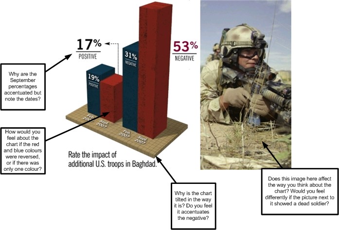
Whatever one things about the surge and FP’s assessment of it, they can do better than just skewing the chart to make the case.
See: Foreign Policy on “The Failing Surge”.
P.S. If you want to see someone better than me take apart such representations, refer to Edward Tufte’s site (for example, here).
P.S.S. I found this at Andrew Sullivan’s site. He has many many good postings on the Surge and the War.
