Tag Archives: art

Another dozen good pieces on artists from Richard Serra to Robert Mapplethorpe


Here’s 12 good pieces on artists that capture a range of feeling, from sadness to gladness and more.

Sadness: the great Richard Serra passed away recently. So too did Patti Astor, head of the Fun Gallery in the 80s. Her obit is here. Deeply sad is this sobering piece on art being made in  Ukraine during the current war.

Badness: The Tate continues to struggle with racist elements in a famous Whistler mural. This story talks about how they brought in artist Keith Piper to help with that. You be the judge of all that.

Also bad: a story of how Jeff Koons squashed a review he didn’t like. Bad in his own way and so very Damien Hirst:  Hirst shark that sold for about 8m is fourth 2017 work dated to 1990s here. Not bad, but controversial is Gerhard Richter’s most divisive work returning. to Auschwitz.

Gladness: things that made me glad are these prints by Lucy Cooper. These great photos by my friend Jared Bramblett, seen here also fill me with gladness. Also great is this story of David Hampton, an 98 year old artist who think making art keeps you alive. He makes a good case.

Longing: Written during the pandemic, this piece on Jason Polan as a flaneur was worth revisiting…there’s so much longing in that piece. (Image above from that piece.)

Boadciousness: not my word, but I think it applies in this piece on ex-Vogue editor Edward Enninful and his thoughts on  Robert Mapplethorpe.


Two good pieces on the recent Keith Haring bio

If you didn’t know much about Keith Haring other than what you read in the recent piece in the New Yorker (which I criticized, here), you might a poor impression of this great artist.

Fortunately more prominent writers than myself have written good things on Haring and the biography in the New York Times and The Guardian. I think they provide the right context for the artist and his times too. Plus they hold him in high esteem. Highly recommend you check them out if you were a fan of the painter or want to know him better.

Making art for your wall with Lego

Normally when I think of Lego, I think of using it to make something recognizable (e.g. things from Star Wars). So I was surprised to see this: Piece Together Your Own Wall Art With the LEGO Modern Art Set. If you love Lego and abstract art, then you can make your own art with those kits featured in that article.

Of course you don’t need a kit to do it. Just go to Etsy and you will see plenty of abstract art pieces made of Lego for inspiration, like this piece here shown below:

Neat!

Now all you need is a pile of old Lego. I have just the thing in the basement from when my kids were younger. I should go down and make some art with it.

It’s a miracle! Gaudi’s Sagrada Familia will be completed! In 2026

According to CNN, Barcelona’s famous Sagrada Familia will finally be completed in 2026. That’s amazing. Miraculous, in fact. For much of the 20th century it was in a state of semi completion. I went there as a young man in the early 90s and even then it was taken as a fact that it would NEVER be completed. But that was not a fact at all, thank heavens.

Barcelona is an amazing city to visit: it’s going to be even more so once the church is done. Go see it if you can.

The “defacement” (some thoughts on Banksy’s latest)

Well no sooner did Banksy paint his latest mural in London then someone else came along and defaced it with white paint. Or did they? In some ways the defacement gives greater meaning to the work. After all, the original tree was defaced with the severe pruning. Now the original painting is also defaced. It made me wonder if the artist added the white paint later.

It wouldn’t be the first time Banksy’s work revolved around the themes of art and destruction. (Recall the self shredding painting or his war with the Gray Ghost in New Orleans.) Banksy has has also posted this quote from Picasso: “The urge to destroy is also a creative urge.”

More on this story from the BBC and the Guardian. Read it and decide for yourself.

Keith Haring was great. People who say otherwise are biased and wrong

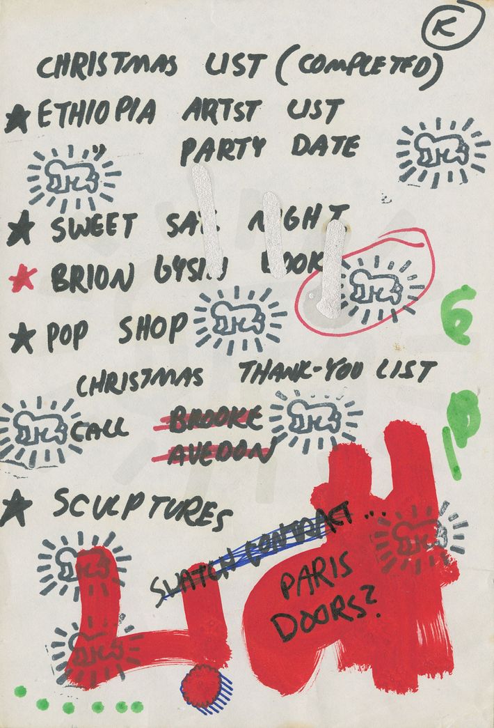
If you’re lucky, you got to see the the Keith Haring show, “Art is for Everybody” at the AGO and elsewhere. I did, and it was a good sampling of the artist and his life. A sampling, but not the entire picture.

If you’re like me, you might want to follow up that show with a new book on Haring by Brad Gooch called ‘Radiant: The Life and Line of Keith Haring’. The New York Times has a rather straightforward review of it at that link.

On the other hand, you may have made the mistake of reading this piece in the New Yorker: Keith Haring, the Boy Who Cried Art. It starts off well, talking about the performance aspect of Haring and the way he painted:

To go on YouTube and watch Haring perform is weirdly gripping

As you continue to reading it, though, you get a sense that the writer does not like anything about Haring. For example:

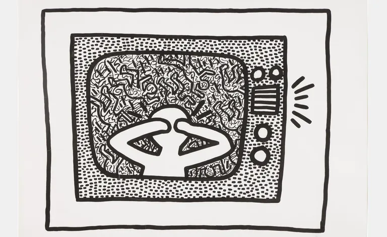
He rarely touched oils, possibly because they looked too organic—he was after something hard and artificial, as well as something that dried quickly. The paintings had a small vocabulary of simple shapes (dollar bills, hearts, globes, crawling babies), applied to the picture plane with no great attention to exact placement or color, like a baker applying sprinkles to a birthday cake. Somehow, bright, rough cartoons had become “his,” so that anybody who dared paint the same was ripping off the Haring brand. There is a sharp, slightly nauseating sort of glee in watching him get away with this, reminiscent of the scene from “Mad Men” in which Don Draper decides that a tobacco company’s new slogan will be “It’s toasted.” Everyone’s tobacco is toasted, but no one else has bothered to plant a flag.

The bold parts are mine. You can see the bias coming to the fore.

He goes on:

It is true, though trivially, that he made it big because he got lucky: lucky with his location, luckier with his timing, and luckiest with his skin color.

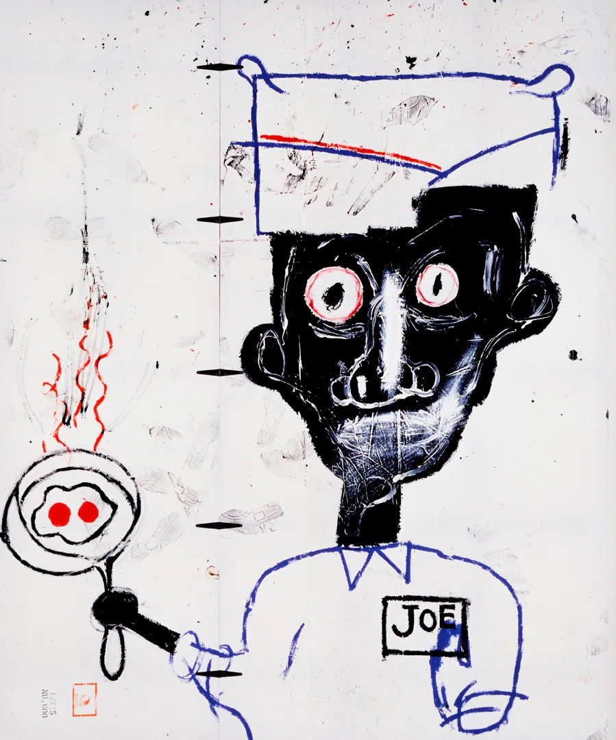
I guess he did get lucky. You know who else who got “lucky” at that time? Basquiat. Different skin color though. Also both men worked tirelessly at their art, and while no doubt luck played a part, their creativity and effort and hustle to be successful played a much bigger part in my opinion. Their good luck was the residue of their hard work.

One of the odd things about the piece is how it doesn’t seem to process how radical Haring’s representation of his sexuality was in the 80s. For instance this paragraph implies it was no big deal:

Art for everybody isn’t for everybody, I suppose, but when Haring tries something less obvious, his shortcomings become more so. An untitled canvas from 1985, teeming with cocks and flames and grinning beasts, is wonderfully self-assured in its intimations of shameless desire—we seem to be looking at a version of Hell, but, if so, then who needs Heaven?

And this paragraph, which equates his work with advertising:

Haring’s style feels—is—the same whether enlisted in the cause of act up or his own bank account, of fighting racism or promoting the Pop Shop. What his images advertised was always changing, but they only ever spoke in advertising’s metallic chirp.

Well that’s one way of looking at him, I guess. You’d think Pop Art never happened, of that gay artists had been accepted forever.

To me, Haring co opted advertising forms like billboards and subway ads with images that superficially looked cartoonish but contained representations that were radical and subversive. He changed our culture for the better. That we no longer see his work as radical is a credit to him and others that pushed for these changes.

Back thrn, critics would often minimize their importance. (Time’s Robert Hughes called them“Keith Boring” and “Jean-Michel Basketcase”.) Now I am seeing critics downplaying their work again. That’s too bad. You might not like the work of Haring. You might see the limits of him as an artist. But you can’t say he wasn’t great, and I don’t think you can say he isn’t great now.
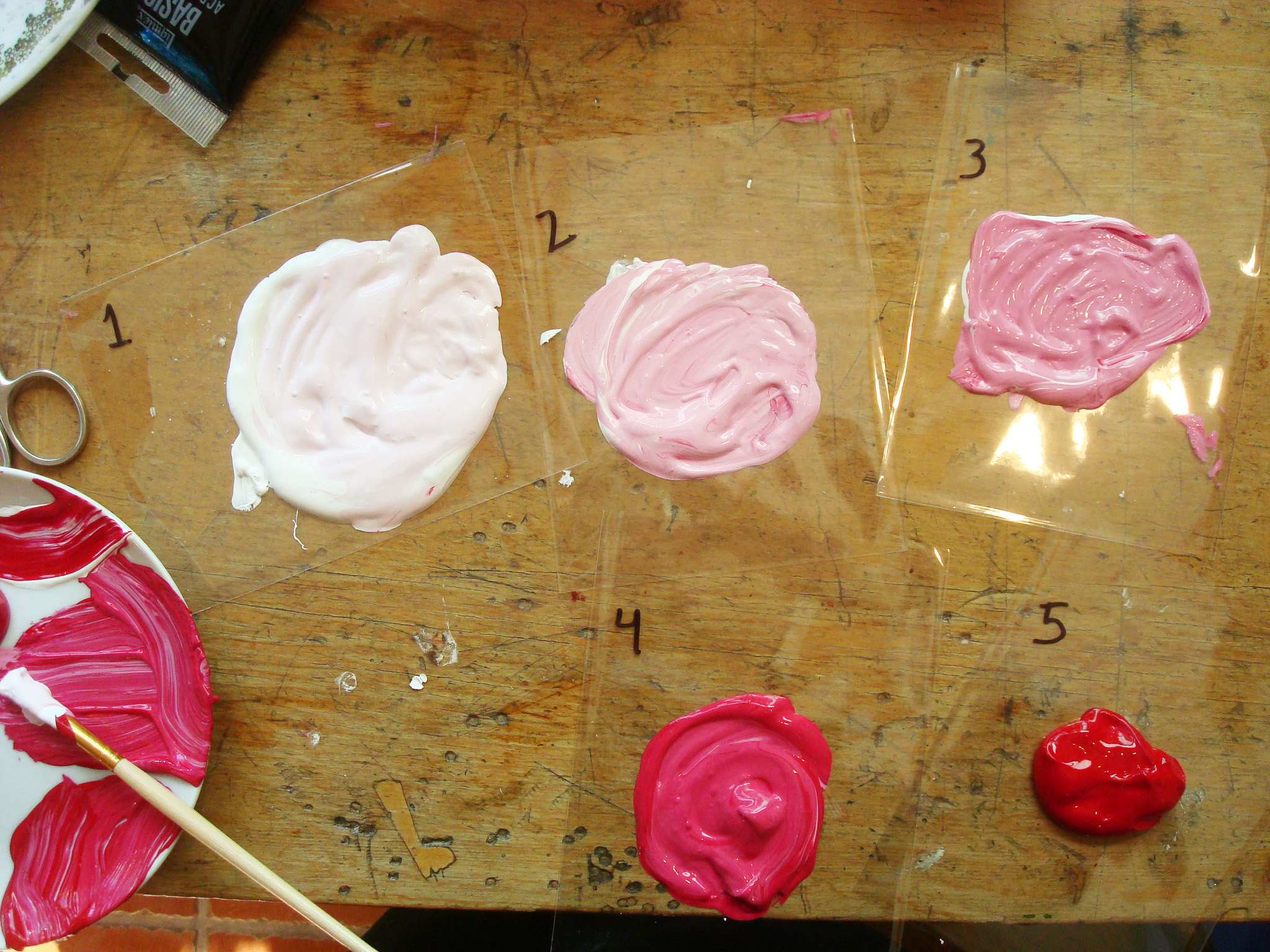


On walking around New York, thinking of Basquiat

I was walking around Great Jones Street in lower Manhattan recently and came across the place that Basquiat lived for a time in the 80s. (Now it’s owned by Angelina Jolie. More on that, here.)

That got me thinking about the artist, so I went searching for more on him and came across came across this, from 1988. It’s something like an obit for Basquiat that focused on the “hazards of sudden success and fame” (from the New York Times.) He deserved better.

Speaking of better, here’s a better piece on Basquiat in California. I tend to think of him solely as being in NY, but he travelled around in his short life.

Finally, it turns out that art forgery is a bad idea: After Fake Basquiats, Orlando Museum Faces ‘Severe Financial Crisis’ (from the New York Times). Quelle surprise!

On Anselm Kiefer’s watercolor paintings

500

I was glad to come across this piece at artsy.com on these Anselm Kiefer’s watercolors. It’s a fine reminder just how great watercolor can be in the right hands, like Keifer’s. It was also a pleasant shock to see him make works so very different than what I am used to seeing from him.  If you know his work, you’ll know what I mean. Regardless of how knowledgeable you are, go over to artsy and check these out.

A Scratch Ticket Vending machine! Win fame!

I love this: truly a vending machine for our times! Instead of scratch tickets that promise us fortune, these scratch tickets promise us fame! Well, if not fame, then many more social media followers. I guess that counts for fame in this day and age.

For more on this amazing vending machine go here.

P.S. Dries is a brilliant artist / technologists: check out the rest of his site, here.

Five good pieces on five great artists for a Friday

The great  Cindy Sherman has a show at Hauser & Wirth on Wooster Street in SoHo NYC. The Times took the time recently to do a long profile on her. I really enjoyed it. It also has a straight up photo of the artist and it was surprising for me to see.

David Shrigley has a very Shrigleyesque work in Australia that involves tennis balls. Click the link to see more to see what I mean by Shrigleyesque.

The Guardian has a review of a Robert Mapplethorpe photography show and they are not keen on it. I was not keen on the review.  If you want to just skip that and check out the (NSFW) show, go here.

The National Gallery of Art in the US was granted a treasure trove of work by the artist Joseph Cornell. You can read more about that, here. (One of his boxes is pictured above.)

Finally the great artist Giovanni Anselmo, of the ‘arte povera’ movement, has died. You can read more about him and the movement, here.

A dozen or so good pieces on good artists, from Michelangelo to Tracey Emin

width

(Top image: Richter. Bottom image: Day)

Using AI in art making, from David Salle to Kevin Kelly (and how Walter Benjamin can help)


Using technology to make art is not new. Gerhard Richter used special software to make the work you see above (4900 colours). Before computers, artists would use lens and photographs and even craftsmen and women to help them create their final artwork.

What is new now is artists (and non-artists) are using AI to make art. Kevin Kelly talks about how he is using AI in his creative process. David Salle has dived deep into making new work using AI. NYT columnist Farhad Manjoo is using visual tools like Procreate to make AI art.

I have seen Kelly’s work, and Manjoo and Salle’s work are on display in their articles. Kelly experiments with AI to produce images in various styles. Perhaps he has changed, but there is no artist in his work that I can see. With Manjoo, you can see more of him in his drawings. And with Salle the artist’s presence comes in as an editor of the works the AI produces out of his original pieces.

In trying to assess these AI generated works, I think Walter Benjamin and his idea of an artwork having an aura can be useful here. Benjamin was thinking about how original art works have an aura that reproduced images of it do not have. I agree with that: no matter how good a reproduction of a work is, it rarely compares to the original work. There’s that something extra in the original.

I think we can extend out the idea of a work having an aura and also having a humanity. What does a work say about the person who created it? What do I recognize in it that is human and unique to that person? What ideas are there that could only come from that person in that time?

You can argue back that this is irrelevant and that AI generated images are interesting and beautiful and furthermore I cannot distinguish them from human generated images. That might be true. Maybe galleries will be filled with images and sculpture with no human involvement whatsoever, not unlike deep learning software that comes up with ways to be best at playing games like Chess and Go. Such AI artwork may be interesting and even beautiful and may seem to have that aura Benjamin talks about. They just won’t be associated with a human.

Even minimal and conceptual art has a humanity associated with it. Duchamp’s Fountain embodies Duchamp’s intelligence and wit and contrariness.  Arp’s “According to the Laws of Chance” likewise shows his interest in pushing the bounds of what is acceptable in a composition of an abstract work. A person is responsible for the work and the work is tied to them. A person is what makes the work relevant to us in a way that a wall covered with children’s collages or a shelf of toilets in a hardware store are not.

We need a new aesthetic philosophy to deal with the firehose of AI art that is coming our way. I propose we tie the art back to our humanity.

P.S. For more on Richter’s 4900 colours, you can see it here on his web site. There’s also a great view of  4900 colors, here,


Contemporary / conceptual art can be difficult to understand. This can help you.

And by this, I mean this piece by Sherri Irvin: Contemporary art is made out of rules that mobilise us to act. It rightly states that…

Conceptual art often confounds. The key is to understand the rules of the artwork and the aesthetic experiences they yield.

She says conceptual art has three sets of rules:

  1. rules for display
  2. rules for conservation
  3. rules for participation

I agree. If you understand those rules, you can better understand works like the one above, Untitled (Portrait of Ross in LA) (1991) by Félix González-Torres. (One of my favorites.) Now you may not grasp everything the artist is trying to express, but you will get closer to it.

I highly recommend her essay. It should open up such work to you the next time you encounter it in a museum or elsewhere.

(Image linked to in the article and is courtesy of the Art Institute of Chicago/Wikipedia)

The difficult of staying controversial as an artist


It’s hard to stay controversial as an artist. Ask Andres Serrano. This piece in the New York Times explains what I mean:

As Pope Francis met with dozens of international artists at the Sistine Chapel on Friday, he sought both to reaffirm the Roman Catholic Church’s commitment to artistic endeavors and to enlist the artists to act as catalysts for change in areas like social justice.

Yet as the group sat amid Renaissance frescoes by the likes of Michelangelo, Botticelli and Perugino — undisputedly one of the high points of papal art patronage — not all of those present had a traditional religious bent.

Among them were the American artist Andres Serrano, whose photograph “Piss Christ,” an image of a plastic crucifix submerged in a tank full of urine, was considered blasphemous when it debuted in 1987.

On Friday, Francis blessed Mr. Serrano and gave him a cheery thumbs up.

A thumbs up! Not too long ago he was reviled for that work. Now he’s hanging out with Pope Francis. It’s hard out there for an artist to stay controversial. After all, if you go through this piece and check out art history’s most controversial nudes, so many are anything but controversial now. Now they are classics. Serrano’s work will become that way too.

A good reminder to artists: being controversial is fine, but it’s hard to maintain. Best to focus on making your work good first: that is what will remain after the controversy dies off.

Art direction! Art inspiration! And other art links


Austin Kleon explains how you can find energy in the gap pictured above. I like the idea of using the gap for your benefit.

I’ve been interested in drawing with ink lately, so here’s some good links on how to ink a drawing and how to make pen and ink drawings here. Two good videos on drawing with ink are here:  Draw with ink and Also draw with ink.

This may be  one of the best guides I have ever come across regarding thumbnail sketching from an instructor at RISD.

I’m a big fan of the artist who draws the Metropolitan Diary drawings, so I enjoyed this piece on what the Metropolitan Diary taught its illustrator about New York.

Here’s a clip I saved of  Peter Falk from Wings of Desire when he talks about the and the happiness with the simple things in life, like drawing. Speaking of Falk, here’s a story on his own art work, here.

I’ve always been inspired by Jim Jarmusch’s Collages and wished I did more. So I was happy when I found this piece on collage art ideas. Really good stuff.

I have always found these Scribbled Portraits of Brooding Figures by Adam Riches inspiring. It reminds me of some of the great drawings my brother Ed used to do.

More links: If you want to take up drawing cartoons; if you want to learn how to Draw a Self-Portrait; if you need more advice on how to draw, How to Draw in Six Steps;  here’s a quick beginner’s guide to drawing.

Finally, here’s some good things to consider:

On Sylvia Plath and other fine visual artists

I knew, of course, that Sylvia Plath was a great writer. But she is also a strong visual artist. This substack post delves into her talent in that regard. (That’s her work, above.)

Not an artist, but their enemy: here’s the obit for the Gray Ghost, famous for painting over graffiti in New Orleans, including Banksy! A fascinating man. Also fascinating is museum met guard Greg Kwiatek and how working there for 25 years helped him make his own art. A third person who is fascinating is  architect Yasmeen Lari.


Check out these Qualeasha Wood tapestries (above) at that link. They are amazing. I didn’t know of her work, but I am impressed.

Of course I know of the work of these two, David Hockney and Anselm Kiefer, both of whom have new work out.

How to rate Hannah Gadsby’s Pablo-Matic show at The Brooklyn Museum?


How to rate Pablo-Matic? Badly, if you are New York Times critic Jason Farago. Ohoh. Meanwhile this piece in hyperallergic argues the show is not great but not terrible. Ok so so-so. Then there is this other piece in hyperallergic that urges you to go because they think the show is good. Hmmm….

I’ve read lots on the show, including how the museum feels (they dismiss the negative reviews). My two takeaways from all that I read are:

  • everyone, no matter how they feel about the show, have valid thoughts and opinions on it. They all come to different conclusions, but the ideas they bring up are worth reading. If you love the show, read the pieces by those who didn’t, and vice versa.
  • the Brooklyn museum can’t lose here. Regardless of what you think, I haven’t read so much about a show in quite some time. Most shows get an objective thumbs up with very little passion. Not this show: people are passionate about how they feel about it. It’s exciting!

I wish more shows were controversial like this. Not controversial in a gimmicky way, but in a thoughtful way. It got me thinking about art and artists in a deeper way than I might have if I went to a non-controversial show.

Finally, I also admire the courage of the curators. It’s like night vs day when I think of other controversial shows like the recent Philip Guston exhibit. We need more courage from people in the world of visual arts. I am glad the folks at the Brooklyn Museum have that.


Advice for all you frustrated artists out there (including me)


Sometimes you can get so hung up about making art you don’t make anything at all. This could be due to several reasons. For example, if you are worried about your style, read this. If you are frozen because you wonder if you are you good enough to be an artist, go here. You can also read this: how to boldly pursue your artistic calling even if youre riddled with self doubt. If you wonder if your art is good enough to sell, click this. For an example, see how this artist  sells art on etsy.

If you think you are no good, get over yourself and read:  7 sins of beginner artists what keeps you from being good and 21 days to be a better artist. If you think you have no skill, head over to this: create art without skill and this: you can draw and probably better than i can. If you think you need to go to art school, read: don’t go to art school. If you think you are too old: why it’s never too late to become an artist. If you need some prompts, go here: Some good prompts from Inktober.

If nothing else, make yourself a zine. Here’s advice on making a zine, on how to fold a zine, and how to make a one page zine. Here’s some zine advice and more zine goodness is there.


On Warhol, Basquiat, and Haring too. All three in the news.

Three of my favorite artists were in the news recently. Andy Warhol made the front page as the U.S. Supreme Court ruled against him and his estate in the Prince Photo Copyright Case. I found that concerning, but less so after I read this good analysis by Blake Gopnik: Supreme Court Warhol Ruling Shouldn’t Hurt Artists. But It Might. I feel it will be ok.

Speaking of Warhol, here’s a good piece in artsy talking about how the once dismissed colloboration between him and Basquiat is gaining greater appreciation as time goes by. A recent showing at Fondation Louis Vuitton in Paris of 70 joint works should help with that.

A long running story has been these so called discovered Basquiats that were on display at a museum in Florida. It turns out that one of the people involved confessed to a forgery scheme regarding these paintings. No surprise there. Glad it’s over.

And why would anyone do that? Well his work now’s the time (shown above) was expected to fetch $30,000,000 at least by the good people at Sotheby’s.

Finally, I was glad to see that Keith Haring is getting a new show at the Broad Museum in Los Angeles. I was less glad to read about how the curator diminished Haring as she spoke about him. Haring was always a serious artist taken seriously. His work is joyful and playful and sexy at times, but it was and is never second rate. That said, see the show. Get more Haring in your life.

On Bourgeois, Wiley, Grosz, and more. (Art news, April 2023)

Here’s some recent art pieces I thought worthy of sharing:

Sydney is set for a summer of blockbuster art in 2023. Bourgeois spiders and Kandinsky masterpieces will be there. I’m a big fan of Bourgeois: I’d love to see that.

Another person who’s work I’m a fan of is Kehinde Wiley. You likely know him for his famous portrait of Barack Obama. The Guardian has a good profile of him there.

There’s no living artist who I am a bigger fan of than Richter. He’s getting very old, though (85), and he is thinking about giving up painting in the future. But for now, here’s a story of how Gerhard Richter Rides Again, in The New York Times.

Other good pieces: Here’s a good essay on the significance of  George Grosz. This piece is on artists and their day jobs (hint: not as artists). Here’s the obit for British sculpture Phyllida Barlow. RIP. Still kicking: here’s what  Ai Weiwei is up to.

Finally, a piece on Chuck Close:  look a little (Chuck) Closer: Aesthetic Attention and the Contact Phenomenon. And take some time to check out this powerful interactive display of the works of  Michael Ray Charles.

On Kazuo Ishiguro’s Top 10 film picks

Over at Criterion they have a list of ten films selected by Kazuo Ishiguro. They have a large collection of these lists, but I especially loved his for two reasons. One, I gained a better appreciation for these particular films. But more than that, I got a better way to think about film itself.

I highly recommend his piece. There is so much good stuff at that web site, including many great films, of course. But take the time and read that.


On Canadian art forgeries, now and then

If you think of art forgery at all, you likely think of internationally known painters like Basquiat. But did you know that here in Canada we also have a history of art forgery? You can read about it here: how a forgery scandal rocked the canadian art establishment in 1962. Of course, you don’t have to go back decades to find this occurring. Only recently arrests were made in a Norval Morrisseau forgery investigation kicked off by a member of the band, Barenaked Ladies. And current forgeries are not limited to Morrisseau. Fake works of the artist Maud Lewis are also coming onto the scene. (And are likely here already.)

Art forgeries are everywhere, including Canada. With that type of money involved, it’s not too surprising.


How great Japanese artists can make you better at art (and much more)


Ok, maybe this lesson on “How to Paint Like Hayao Miyazaki” will not result in work of his stature, but it was interesting to see how basic his technique is. Great work, simple approach.

Here’s a piece on much much older drawing lessons from Katsushika Hokusai Who Famously Painted The Great Wave off Kanagawa. The lessons themselves are online. You can get a sample of them, here: Japanese – Quick Lessons in Simplified Drawings. Old but still relevant.

As for other tools (some NSFW) that can help you draw and paint, there’s Figurosity, Figure drawing poses and gesture drawing tools. There is Magic Poser Web. Give intro Line of Action a visit. Lastly, here’s 20 Artistic Prompts to Get You Through a Creative Slump.

Speaking of NSFW, here’s a good online lesson on Drawing with Charcoal in Craftsy, that I found really good.

Need more help? Here’s a good exercise from Austin Kleon:  The 30-minute noticing workout.

Here’s a wealth of  Watercolour lessons for anyone who wants to go that way.

This article on Netherlands-based designer Teun Zwets who makes storage from residual or waste materials is inspirational, I thought. Look at how beautiful they are.

Maybe making art from discarded things is a good inspiration for you, too.

Need more inspiration? Read this, which has famous artists talking about how to be an artist.

Now get to work.

It’s Saturday. Here’s a handful of good pieces on great artists

First up: can art save your life? The artist Robert Moore thinks so. Good artist, good piece. Relatedly but sad, the well known Canadian artist, Mendelson Joe, has died. He wrote about it on his web site, here. RIP, good sir.

On a lighter note, here’s a funny story on the Italian futurists and pasta. Elsewhere in Europe, mystery artists! This is a good story on one such sculpturor from Amsterdam. And this piece highlights the mysterious artist Invader as he unleashes his art on Paris and the world.

Back in Canada, here’s a good story on one of my favorite contemporary Canadian artist, Peter Harris, over at CTV News. Down in the US, this is a terrible story on how San Francisco gallerist Collier Gwin was arrested for hosing down an unhoused woman in front of his gallery. Meanwhile over in Japan comes a wonderful story on what Kazuo Oga thinks about when he thinks about backgrounds.

I love Marcel Duchamp. Here’s a piece on his work, Network of Stoppages. Speaking of Duchamp, here’s an art book on Marcel Duchamp from Hauser& Wirth. As for other old artists, painter Jonah Kinigstein who lived until almost 100 and stayed figurative when the art world went abstract. Hang in there, artists.

I don’t want to forget to bring up this sharp commentary on the great Anselm Keifer, who is always a challenging artist.


Finally these are stunning: Miniature Ships Sail Atop Asya Kozina’s Extravagant Baroque Wigs of White Ships. Thanks to Collosal for this. Aslo from Collosal: Ruby Silvious garments (seen above).

The Louvre’s Mona Lisa problem

The Louvre has two problems with the Mona Lisa. 1) It’s too hard to see:
Looking for Elbow Room, Louvre Limits Daily Visitors to 30,000 and 2) it’s too delicate to take out of the museum: The Mona Lisa Will Not Be Going on Tour After All, the Louvre Says.

Sadly you could paint a fake Mona Lisa and no one would know, since it is so hard to see it if you are in the Louvre. Maybe that’s what they should do! Seriously I don’t know what the solution is: people have it on their bucket list of things to so (and I can only imagine it is worse now in the heyday of social media).

Needless to say, billionaires like the fictitious one in Knives Out: Glass Onion could not do what was portrayed there. 🙂 Want to see the painting: take your chances and battle the crowds in Paris.

On the Embrace


There’s been plenty of reaction to the above sculpture, “Embrace”. You can get a sample of the it in places like the Washington Post, NBC, and the artistic website hyperallergic.. Not all of it, but a lot of the reaction has been….not good.

If you are unaware, the city of Boston unveiled “Embrace” just this month. The work is based on a photo of Martin Luther King and Coretta Scott King and it represents part of that photo. Conceptually that’s a great idea. In reality, it’s not, at least according to many who’ve seen it.

Having read a number of reactions to it, I think the problem can be seen if I ask myself  the question: is it a monument or a sculpture? It has elements of a monument: it is a large realistic work in bronze of a famous and celebrated couple. It also has elements of a work of art: it is symbolic and abstract in a way. As a result, it falls somewhere in the middle between monuments and  sculptures. And in falling in the middle, people get unsure of how to process it, I believe.

Of course, monuments can be abstract and non-representational: take the Washington monument in D.C.  And sculpture can be bronze and representational: think of anything by Rodin. Even monuments that are abstract and non-representational can be controversial, as the Vietnam Veterans Memorial showed when it was first unveiled. There is no formula for what works that will guarantee that a monument or sculpture will win acceptance.

I do believe, though, that if the Embrace was realistic like the Martin Luther King memorial in Washington, it would be more liked. Likewise, if it were made of something other than bronze and made more abstract, people might be confused but less vitriolic about it. Alas, it is what it is.

I feel in the long run this work will come to be accepted and even loved. Works like this weave into the lives of people, and as they do, they become parts of the best of them. I also hope we see more sculptures and monuments of great African American leaders such as the Kings. That’s an idea we should all embrace.

On the art at Toronto’s Union Station and the people who don’t like it


According to BlogTO, there’s some chatter over on…

…a recent Reddit thread that has amassed hundreds of comments, one user wrote, “Union Station has the most depressing, unsettling art. No part of it sparks joy. Will they ever change this?”

I understand why would you would think the work is bad if you think it is trying to spark joy or some positive feeling. If you think that, I’d like to give you a different viewpoint.

My view of the work changed when I started thinking about it in comparison to what I typically see in the subway. What I typically see is…advertising. This work is everything ads are not. Ads promise a better life: this work shows life as it is. Ads are often unrealistic: this work is grounded. Ads are often polished and simple images: this work is rough and complex. To me it is refreshing to see this art in comparison to the overwhelming commercial imagery everywhere else in transit.

Art can spark joy, but it can do much more than that. This work, called Zones of Immersion by Stuart Reid,  may seem depressing to some people. For me it causes reflection and it gives me some perspective of my time underground. And because of that, I think it’s great. I look forward to see it when I’m at Union Station. I hope someday more people feel that way.

On twitter and art and the aesthetics of a Canadian painting by Chris Flodberg

In mid November the Twitter account Canadian Paintings posted the above work by artist Chris Flodberg. At the time I said: “I see some people don’t like this painting but I think it’s fantastic. Just like the Gare St Lazare paintings of Monet are fantastic. They reflect our lives. I even like the palette of this one – it’s a muted palette that goes well with the subject matter. Good composition too.”  That tweet led to a good discussion on the work and to aesthetics in general.

I really do think it is a great painting. For one thing, I love the idea of it. The viewer is on the precipice of entering the painting in their car. If you have ever driven on such a road, you can easily imagine going down the hill and merging with the traffic and then heading over the horizon. Flodberg has positioned the viewer so that the go down and to the left, then up and under (a bridge) and then to the right, giving the painting a dynamic feeling.

There’s almost a danger too, with the concrete walls everywhere. Plus the fact you are about to enter a high speed highway. The dynamic and the danger make the painting exciting to me.

It’s interesting to me what he has put in the painting: the office buildings to the right and a jumble of stores to the left. The objects that make up the painting could be anywhere in a big suburb in Canada (or the US). It has a universality in that regard. I thought it was of a part of the 401 near me: turns out it’s near Calgary. (Fun exercise: compare the painting with the images in that link…how does it make you think differently about the painting.)

Flodberg is not the only Canadian to paint a highway. If you do a search like this on Christopher Pratt or this on Jack Bishop, you can easily see that. Canadian landscapes contain many things, including highways: it makes sense good painters want to paint them.

Speaking of Pratt and Bishop, I get why some people don’t like Flodberg’s painting: his colors are dull and dark in comparison. But I think they perfectly capture many a day I’ve driven along stretches of the 401. Some of those days were mundane, and some were magical. They all get stirred up in my imagination when I take time to look at the work above. A great work, I believe.

I don’t think I would have come across this work if it wasn’t for twitter. Nor would have thought about it deeply if it weren’t for the comments people tweeted. Twitter has many flaws, but there are times when it does things no other site does. I am grateful for that

For more on the work of Flodberg, you can check out his site, here: Chris Flodberg – artist

On Michael Snow, Toronto’s artist

Michael Snow died last week. It’s hard to think of an artist whose work is as well known and as well photographed as his. Even people who know nothing about art have likely seen his sculpture at the Skydome, not to mention his Canadian Geese sculpture at the Eaton Center. His work is spread throughout the city of Toronto, and the city would lose some of its luster without his creations.

Of course you can read about his life and career in wikipedia, but I also recommend taking some time and read this: Michael Snow, Prolific and Playful Artistic Polymath, Is Dead at 94 in The New York Times. The Times piece has more on his role as a filmmaker and how influential he was there.

R.I.P. Michael Snow.

(Top image is from Wikipedia: bottom image is from the New York Times. Attribution for the Wikipedia image here)

The best movie posters of 2022….


According to CreativeReview.co.uk…

the best movie posters of the year once again demonstrates a wonderful array of traditional techniques and styles – photography, painting, collage – and a refusal to homogenise into any singular form. One pleasing commonality: as yet, the world of film poster design has resisted any incursion from AI-generated art. Whether their creation was through physical or digital means, by one hand or many, each of them is a product of human creativity.

I thought the AI reference was noteworthy. More noteworthy are the posters themselves. You can find them, here: Movie posters of the year 2022.

Drawing is underrated. Let me and Henry Moore (but not Francis Bacon) convince you to rate it higher

I believe drawing is underrated. One of my favorite painters, Francis Bacon, was one of many who was dismissive of it. If you are one of those people, I have some links for you.

First off, Modern Met has this: 10 Artists Who Were Masters of Drawing, From Leonardo da Vinci to Pablo Picasso. While they are known for more than their drawings, their works of pen and pencil are inspiring.

More great drawing (to me) can be found here: Moore drawings of coal miners during wartime. You can see one of them above.

Finally, here’s a fine drawing by Van Gogh to serve as an inspiration and a reminder of how great drawing can be: Landscape in Stormy Weather 1885.

Seeing all these images makes me want to draw again. (This was an especially good link, as I have been enjoying drawing with charcoal: everything You Need to Know About Drawing (a nude/figure drawing) With Charcoal.) I hope you are inspired as well.

On the new subway mosaics by Yayoi Kusama and Kiki Smith (and other works by fine artists)

Over at the New York Times they have a write up on the Yayoi Kusama and Kiki Smith’s Grand Central Madison Mosaics. They look fantastic. Very few art installations can achieve the viewing that those in subways achieve. It’s important to have really great work there, and in this case, I think the work is great. But see for yourself: check out that Times article. Better still, go to the subway in person.

Speaking of mosaics, this piece on how  Chicago artist Jim Bachor fills potholes with mosaics is great.

Also great:  Sheree Hovsepian’s Poetic Assemblages now showing at Rachel Uffner Gallery.

Why not take a look at the  Household Surrealism art by Helga Stentzel?

Tom Phillips died recently. I’m a fan of Austin Kleon and he was influenced by Tom. I can see why. For more, see Tom Phillips obituary  in The Guardian. Also this  Tom Phillips – Works and Tom Phillips – A Humument.

Finally, two extremes: this, At Art Basel Miami Beach the ATM is the new banana, vs this which is “an exhibition in Berlin shines a light on class, showing how social and financial inequality affect how art gets made, sold and displayed”. I was moved by the latter.

(Images: links to the Times story on the subway art installations)

The fine photography of Jared Bramblett, London and elsewhere


My friend Jared Bramblett was recently in London, and as he does, he took some fantastic photographs of his visit, which you can see here:  5 Days in London – Jared Bramblett.

Once you check that out — and you should — take some time to look at the rest of his site. It’s wonderful.

(Image: link to image on his site.It looks so much better on his site.)

On the wrongness of vandalizing famous paintings


Well, attacks on famous paintings continue. Since the initial throwing of  tomato soup on VanGogh’s Sunflowers, we have had vandalism on a number of works, including someone recently pouring black liquid on a Gustav Klimt painting in Vienna .

I have to say that I hate these acts. I think they achieve little and the idea that we need this form of protest to gain attention to climate change is ludicrous. As they attacks continue what I fear is this: people who resort to destructive means to gain attention will resort to more drastic forms of destruction once the spotlight moves on.  So far the works have not been seriously damaged: there’s nothing to say it won’t escalate to that point.

In response to this, some museums are bringing on undercover cops. The people who targeted  Vermeer’s Girl with a Pearl Earring are going to jail. Needless to say, all museums are being much more strict about what can be brought into the galleries they provide.

That’s leads me to the other fear I have. Long after these protests have moved on, museums may end up becoming a much less open space for people to view works. One thing I love about museums is that I can walk right up to works of art and examine them closely for as long as I want. Others can take in their own art supplies and study and copy the works to become better artists. All that is due to the openness of museums. That could all be lost due to these protests.  And that would be a great loss for anyone who loves the visual arts.

Great advice for anyone from 6 to 66, from Nick Cave (be foolish and be basic)

So someone named Chris wrote to Nick Cave and asked, “I’m 62 years old and decided to learn how to play guitar. Rock guitar. Is such an endeavour a fool’s errand for someone of my age?” To which he replied “Yes… AND…”. I think anyone considering starting something new should read it. (It can be found here: Nick Cave – The Red Hand Files – Issue #210 – I’m 62 years old and decided.) It reminds you that you can suck and you may be too old (or too short, tall, thin, fat, shy, awkward, etc.) but that good things can come out of it if you keep at it.

Reading it, I was reminded of the classic three chord recommendation: learn three chords and form a band! Why not? If this got you thinking hey maybe I should learn to play the guitar, then you might find this useful: Guitar card cheat sheet. Start with E. 🙂

BTW, I think the advice “learn the basics” and then get out there and make something is good for any creative endeavour, be it drawing or making a web page. Don’t try to learn a lot at first. Learn enough to get started and go from there.

P.S. I think “Yes….AND…” is a great way to answer things. It acknowledges the concerns someone might have while opening them up to possibilities they might not have considered or appreciated.

(More on three chords and form a band, here (and where I got the image from))


13 good pieces on 12 good artists (and Damien Hirst :))

I’ve been reading much on artists lately. (If you follow this blog, you know.) I thought these 13 pieces on different artists were all good, even the one on Damien Hirst.

Was Andy Warhol a Lame Copier? Some judges think so. I think that this is crazy, but read it and just for yourself.

Gone and once overlooked, but overlooked no more: here’s something worth reading on Lee Godie, the eccentric Chicago Street Artist.

If you are interested in Keith Haring, this talks about a new showing of his work in LA

For fans of philosophy and art, you might want to read about the links between Nietzsche and Rothko. Intreguing.

This is for fans (and there are many) of Hilma af Klint .

A good obit on a fascinating painter: Pierre Soulages, who painted in one colour ( black).

Ho hum: Artist Damien Hirst just burned 1000 of his paintings and will soon burn more. 1000 paintings? More like 1000 photocopies. Anyway, Hirst continues to do what he does best: make money.

This is a good question: How Did a Minister Come to Own Hundreds of Edward Hoppers?

As a fan of John Atkinson Grimshaw, I recommend this 5-Minute History.

This is a good piece on General Idea.

And this, on Maud Lewis forgeries, is a sign her work is bringing in big money.

I don’t know too much about Rodney Graham but this obit made me want to learn more.

There was lots of buzz recently about how a Mondrian painting has been hanging upside down for 75 years!

(Image is of Paintings by Soulages at the Musée Fabre (photo by Fred Romero via Flickr) – linked to in the piece on him)

It’s Sunday. Let’s make some art. Here’s some links to help with that.

First off, if you are stuck on the the never ending question:  Why make art ? then read that. Austin Kleon has an answer: art gives you a chance to study something you love in depth.

Ok, let’s talk tools. I love these pens. If you’re wondering how to use them: How do you use a Micron pen to draw? | In My Sketchbook. Speaking of tools, I love conte…more on that hereConte Crayon – Drawing Techniques – Joshua Nava Arts. and  Drawing with Conte crayons.

Instagram has some good advice for artists. For example: here’s some good drawing advice from Instagram. Also from IG: how to make flesh color with paint.

For people struggling with this: draw a head with a 5×8 box, read that. If you are  drawing on toned paper, then read that.

You may not be Andy but you can silkscreen like Andy Warhol.

This is helpful if you are stuck wondering what to paint: DPW – The DPW Painting Challenges. This is a good way to get better: get faster …How to draw faster 

I just like these: Amy Beager’s Dreamy Paintings.

Finally, a cool way to turn photos into images you can collage with Photo Editor: BeFunky.

The great Steve Keene is having a moment

As Fineartsglobe.com says, Steve Keene is having a moment. Perhaps it’s because there is a new book on him: The Steve Keene art book. Whatever the reason, I am glad that he is getting more attention and recognition. Not that he is unknown. There’s been profiles done on him in Garden and Gun , Gothamist.com, BKMAG.com, Artsy.net…even the the New York Times.

if you don’t know him and wonder why you should care, read any of those pieces. In a nutshell, he’s an incredible artist who is the direct opposite of people like Damien Hirst or Jeff Koons. Keene makes a lot of art and sells it for next to nothing. Despite that, he is a good painter with a strong technique and a fine use of colour. I admire him. I hope he and the book continue to have success.

For more on the book, see Pitchfork. Image above is a link to a page from the book.

What do Brad Pitt, David Salle, Steve Keene and Diane Arbus have in common?

What do Brad Pitt, David Salle, Steve Keene and Diane Arbus have in common? They all are artists I’ve been reading about over the last few weeks and months. Now you can too.

In addition to reading about those four, there are additional pieces below on other artists of note. Most of them are painters but there are some sculptors too. Quite a mixed bag! Enjoy!

(Images linked to those in the Washington Post and Colossal).

Andy Warhol, or thinking about when an artist is influential and young vs when they are older


Watching the Warhol Diaries documentary on Netflix, I started thinking about when an artist is influential and young vs when they are older. Like many, I am aware of the early Andy Warhol. If you think of Andy at all, you likely have some of these  Warhol works in mind. When I read references to Warhol and his influnce, these are many of the works cited.

One of the things I liked about the documentary is that it spent time on his later works. Two later commissions in particular I did not know much about. One of these was his Last Supper paintings. And the other was a group of portraits he did called Ladies and Gentlemen.

In both commissions, the Netflix documentary dives into the complexity of Warhol’s life at the time and how it affected the creation of these works. The religious nature of Warhol and his thoughts on death in the era of the AIDS crisis really comes through in the Last Supper works. While with Ladies and Gentlemen, the paintings take on more layers of meaning when you think of all the things going on in Andy’s life at the time, from the commercial celebrity portraits he was producing to the increasing openness of being gay in NYC in the 70s to his desire to be a model.

In some ways, I prefer these later works to the paintings and sculpture he made in the 1960s. There’s a depth to what came after later, a richness. They aren’t as influential as the Brillo Boxes or the Marilyn Monroes, but they are better.

Perhaps that is the case with many great artists. Even someone like Rembrandt. There is more of the artist in the later works,  but the works that made them famous are the earlier works, and those are the works that are mostly remembered. It makes sense in some ways, and is a shame in other ways.

It makes me wonder what would have happened to Basquiat or Haring if they had survived into the 1990s and beyond. What works they would have made. How they would have matured. Perhaps we can look to Warhol for this. Warhol too should have died when he was gunned down and almost killed, only to be resurrected on the operating table. We know how he turned out. I’d like to think of Haring and Basquiat doing the same.

If you have the time, watch the Warhol Diaries on Netflix. It’s a good series.

For more on this, the Tate has a good piece on the people who modelled for Ladies and Gentlemen. The Guardian has more on Ladies and Gentlemen, here. Finally Christie’s has something here on the Last Supper paintings.