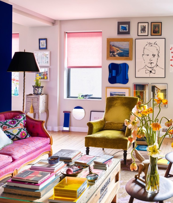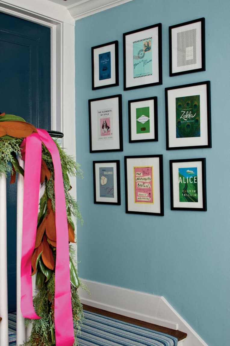
Last week I wrote about white paint. Now for something completely different: bright colours! This piece is a great guide for how to use colour in your home, which is especially good for people shy about using bolder colours: Complementary Colors & How to Decorate With Them | Apartment Therapy
In a nutshell: “Complementary colors, when used together in color schemes, are especially dynamic and pleasing to the eye.” So find your favorite colour, find its complement on the colour wheel, and use that as your guide.
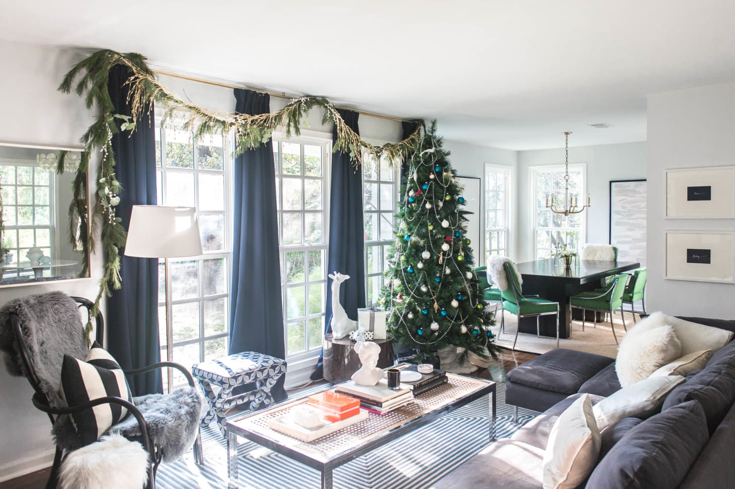
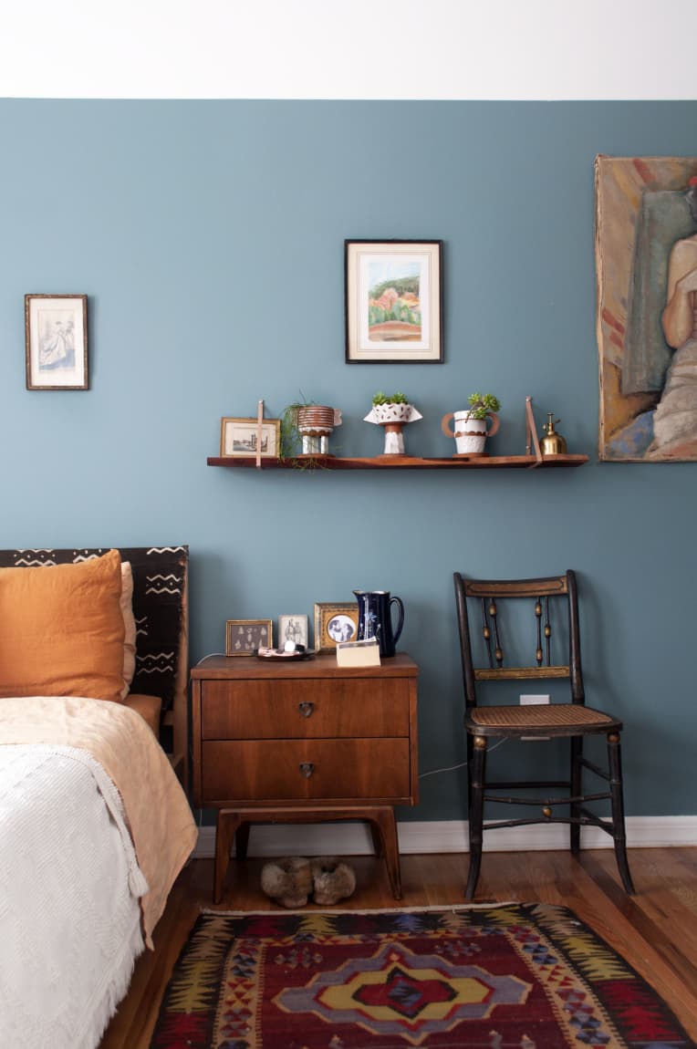
My small tip: if you love a certain colour (e.g. orange), then look to use the complementary colour in the background (e.g. blue sofa, blue wall colour). Then you can fill the foreground with objects in your favourite colour.
Another tip: use artworks containing both colours. Obviously you should love the art first, but if you have many pieces you can hang or display, aim to use those that fit in with the overall colour scheme of the room. (See the image above for examples of this. It’s a good example of how blue and orange go together.)


 If you thought about growing a vegetable garden this year, I highly recommend this piece:
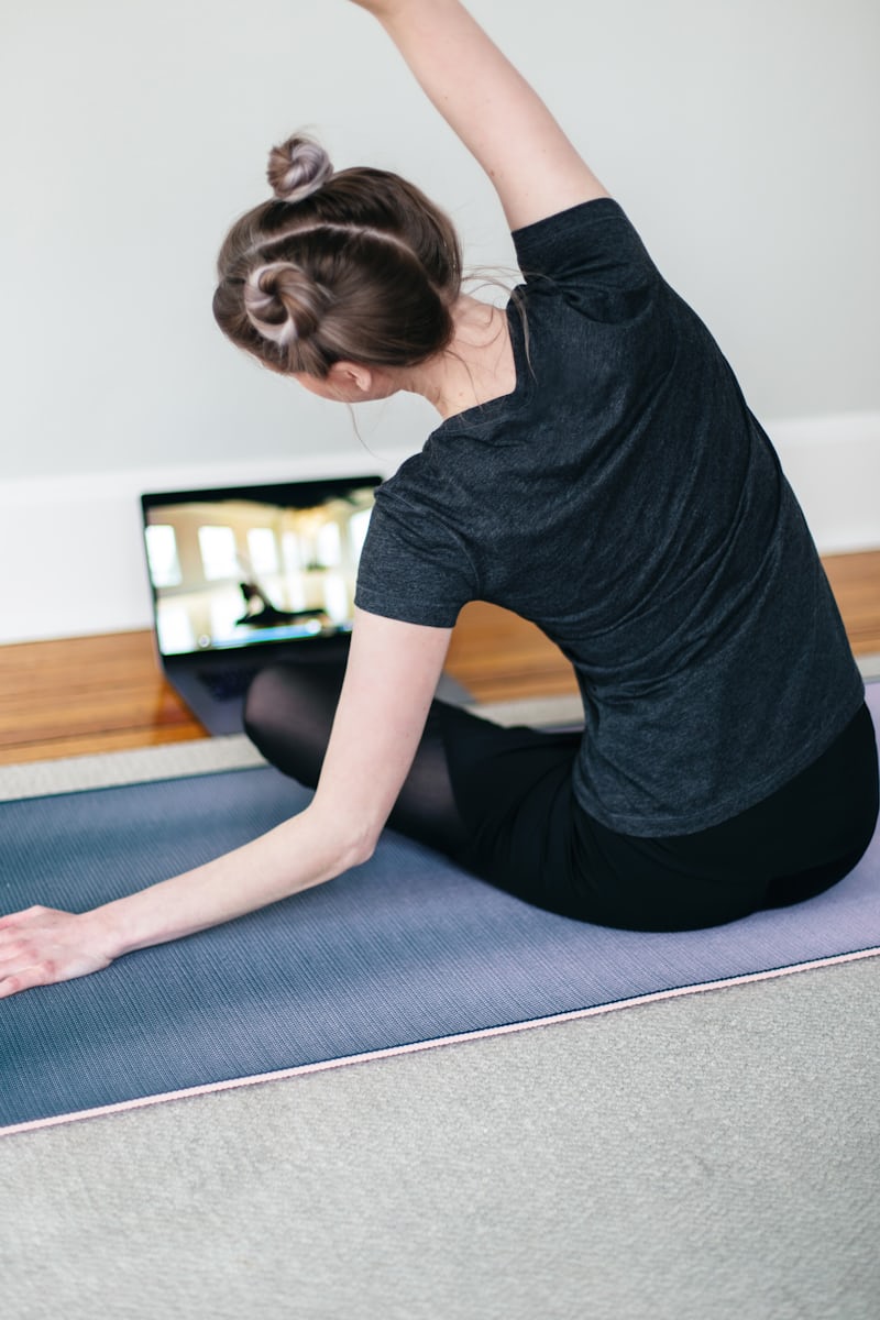
 It’s tough being at home all the time during the pandemic. It’s tougher still if you live in a small space. Indeed, the sameness and smallness of it can get to you.