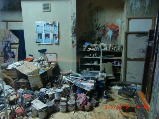
As a frustrated artist, I not only gather links about artists, but I also gather links about art. Here are just some of the ones I’ve picked up recently:
If you want to be an artist, it might be good to ask established artists what their thoughts are. Artsy.net did a series on this, and I put together a list of just some of them:
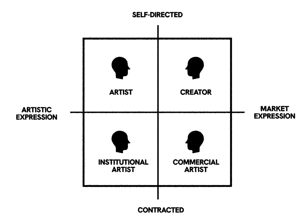
Also helpful, swissmiss has a good piece to help you determine the type of artist you are / want to be:Artist vs Creator
If you decide you want to be a painter, here’s some things to get you started. Sometimes all you need to do is to start. (These are taken from the book Learn to Paint in Acrylics with 50 More Small Paintings: Pick Up the Skills, Put on the Paint, Hang Up Your Art. I recommend it and Learn to Paint in Acrylics with 50 Small Paintings: Pick up the skills * Put on the paint * Hang up your art):
- Paint a Daisy (Beginner Tutorial Using Acrylics) — Empress of Dirt – empressofdirt.net
- Paint a Lemon (Beginner Tutorial Using Acrylics) — Empress of Dirt – empressofdirt.net
Maybe collage is your thing. If so, check out:
-
I used these recently in a collage: Monster heads
I am a big fan of trois crayons drawings, so I liked this: Chalk it up to three colors: bring together color, form and design by using the trois-crayons technique–traditionally only red, black and white chalk
Conceptual art isn’t for everyone, though it is for me. Perhaps you might want to consider that route: Conceptual Art 101: A Beginner’s Guide | DailyArt Magazine – www.dailyartmagazine.com
Finally, kintsugi is more than just a way of repairing things. To see what I mean, check this out: Trevor Noah Explains How Kintsugi, the Japanese Art of Repairing Pottery, Helped Him Overcome Life’s Tragedies | Open Culture – www.openculture.com


 I’ve posted before on