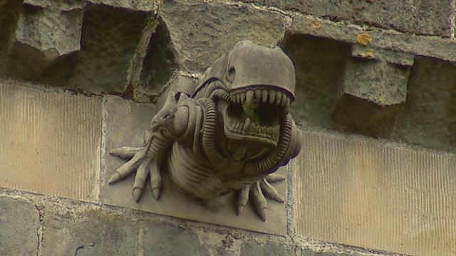
Something cool: an ‘Alien’ gargoyle on an ancient abbey

It’s not a hoax: there is a  gargoyle on a 13th century abbey that looks like something out of Alien. Seems the old gargoyles were falling apart and artisans were recently brought in to make new ones…and well, someone took a few liberties.

All of the new beasts attached to the abbey are excellent. You can see more of them, and more of the story, here:  ‘Alien’ gargoyle on ancient abbey from BBC News

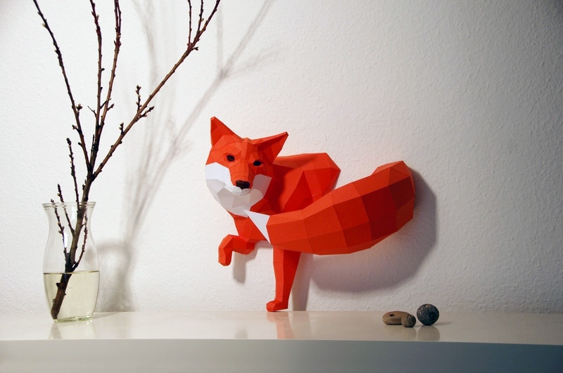
Something beautiful: DIY geometric paper animal sculptures by Paperwolf

These paper sculptures by Wolfram Kampffmeyer (aka Paperwolf) are gorgeous. You buy them and make them yourself. Simply go to Etsy, here, and order a from a range of different animals, sizes, and prices. Great gift idea, too.

If you want to see more of them, you can also check them out here: DIY Geometric Paper Animal Sculptures by Paperwolf. Not surprisingly, from Colossal.

What do Renaissance artists and animators have in common?

Cartoons! Well, there’s more to it than that, as this fascinating post shows: The secret to great Renaissance art: tracing (Vox).

I knew Renaissance artists did sketches: I didn’t know that they used them as stencils. In hindsight, it makes sense: to make such great paintings, it is best to work them out in detail first and then focus on paint.

Two good articles on David Hockney in the Guardian

The first one is a summary of his new show in L.A.: David Hockney unveils new works on perspective created in Los Angeles | Art and design | The Guardian.

The second one is a meaty interview: David Hockney: ‘Just because I’m cheeky, doesn’t mean I’m not serious’ | Art and design | The Guardian.

I enjoyed the interview alot: it is a great review of his career, plus it talks about many other great artists of the second part of the 20th century.

Anyone interested in modern art would enjoy both of these.

The Holiday Season is upon us. You need great gifts. You need to go to Art Interiors

Why? Because it is their annual festival of the smalls. As you can see from the JPEG above, they have art from $55-$250. Great pieces too. Perfect for the Holidays.

Want more info? Go here: Affordable Artwork / Art Interiors / Toronto Art Gallery. Bonus: lots of the work is viewable online.

Highly recommended. Make it a holiday tradition.

You want to take better photos with your digital camera? Henri Cartier-Bresson has 10 tips for you

Ok, it’s not advice directly from the Master. However, the author of this piece, 10 Things Henri Cartier-Bresson Can Teach You About Street Photography, has distilled 10 lessons from Cartier-Bresson’s photography that easily applies to digital photography. Anyone looking to take better digital pictures can benefit from this lessons, especially the last one:

 Always strive for more

Should you go to (film) school? Some brief thoughts on education

If you read this Open Culture post, Director Robert Rodriguez Teaches The Basics of Filmmaking in Under 10 Minutes, you’d be inclined to say “no”. As for me, I appreciate the points raised in the piece. Much of directed learning in school is less than valuable. That said, there are many ways to learn: experience, reading and watching how others do things, schools and teachers. The idea of limiting yourself to one way of learning is to deprive yourself unnecessarily. Learn any which way you can.

The nine circles of hell from Dante’s Inferno recreated in Lego

Not your everyday Lego project, to be sure. And yes, this is just as amazing as you might think.  Hell is no less scary when done using blocks.

For the entire series, see: The nine circles of hell from Dante’s Inferno recreated in Lego by Mihai Mihu – Telegraph

It nicely highlights the sculptural aspect of Lego is only limited by the imagination of the builder-artist.

Thoughts on the architecture of the TTC

Is the TTC architecture bad? It’s something I have been thinking about after the critical comments from “A.R.” in which he pointed  out that: “Toronto has some interesting subway architecture, as well. you know. Maybe you should appreciate some of the creativity in the system” in response to my comment that “Toronto subway stations…look like washrooms without the necessary plumbing”.

I think alof of Toronto subway architecture is, if not bad, then boring. In this blog post I found, David Ahm from the TTC agreed, saying, “The Yonge-line stations are from the ’50s and ’60s and are functional but kind of boring.”

This blog post with Ahm’s comments were interesting, because you see the challenge of designing a subway station, budget being one serious consideration. But that doesn’t mean there can’t be interesting design work done on a subway, and in fact, lots of Toronto subway stations are well designed. And despite limited budgets, the TTC is looking to have better and better stations in the future, which is a good thing indeed.

Of my favourite stations, the ones I most like are Old Mill, Rosedale, Yorkdale and Dupont. I like the openness of Old Mill and Rosedale. They belong to the neighborhood, somehow. I feel like I am in a different city when I am waiting for a train (or a bus) at the Rosedale station. And I love the windows of Old Mill. Perhaps it is no coincidence that they are both above ground subway stations.

I also admire the design of Yorkdale and Dupont. Yorkdale makes the subway system itself seem dynamic, while Dupont is like an experiment in subway station design.

I like other stations too, like Queen’s Quay, Museum and St. Andrew and St Patrick. Of the latter two, I like the “tube” like design of the tunnels. It reminds me of a European subway station.

One thing I really like about the TTC is their choice of artwork. It is a collection of some of the best Canadian artists, from Charles Pachter to Joyce Wieland to Micah Lexier. And the scale of the work is striking, whether it is the 1.5 million one-inch tiles, used by Toronto artist Stacey Spiegel to create Immersion Land or 3000 handwritten samples that Lexier collected over 5 years to create “Ampersand”.  Anyone visiting Toronto should stop at various stations just to see it. (You can get a sample of it all by going to http://en.wikipedia.org/wiki/Toronto_subway_and_RT)

Robert Lepage Brings His Magic to the Metropolitan Opera in NYC

Robert Lepage is bringing his brilliant stagecraft to the Met in New York with a production of “Faust”. I’ve seen LePage’s “Erwartung” and “Bluebeard’s Castle” and I thought they were exceptional, but he seems to be doing something really incredible with this production, as he intertwines the production with the voice and movement of the performers, so that the entire show interacts. You really want to read the article and see the video, so visit Techno-Alchemy at the Opera – Robert Lepage Brings His ‘Faust’ to the Met – NYTimes.com

I would love to see this show.

Kevin Kelly’s Cool Tools: Art and Fear

Kevin Kelly, in his list “Cool Tools”, has excerpts of what looks like a good book for anyone who wants to know not just about making art but being creative generally. Here’s a link to the site, and here is a fascinating story from the Cool Tool: Art & Fear

‘The ceramics teacher announced on opening day that he was dividing the class into two groups. All those on the left side of the studio, he said, would be graded solely on the quantity of work they produced, all those on the right solely on its quality. His procedure was simple: on the final day of class he would bring in his bathroom scales and weigh the work of the “quantity” group: fifty pound of pots rated an “A”, forty pounds a “B”, and so on. Those being graded on “quality”, however, needed to produce only one pot -albeit a perfect one – to get an “A”. Well, came grading time and a curious fact emerged: the works of highest quality were all produced by the group being graded for quantity. It seems that while the “quantity” group was busily churning out piles of work – and learning from their mistakes – the “quality” group had sat theorizing about perfection, and in the end had little more to show for their efforts than grandiose theories and a pile of dead clay.’

Edward Burtynsky’s Quarries on exhibit in Toronto


At the NICHOLAS METIVIER GALLERY is Edward Burtyhsky’s Quarries. As he says:

“The concept of the landscape as architecture has become, for me, an act of imagination. I remember looking at buildings made of stone, and thinking, there has to be an interesting landscape somewhere out there because these stones had to have been taken out of the quarry one block at a time. I had never seen a dimensional quarry, but I envisioned an inverted cubed architecture on the side of a hill. I went in search of it, and when I had it on my ground glass I knew that I had arrived.”

It is on for a few more days: check it out if you can.

The shattered Still Life of Martin Klimas

Over at The Morning News – Still Life

is a feature on an amazing artist, Martin Klimas, who as the artlcle says,

destroys a lot of clay to make his art. Combining the silence of Eadweard Muybridge’s horse pictures with the association-rich composition of a still life, Klimas breaks recognizable objects so they become something else, and stops us just at the moment of transformation.

(Thanks to andrewsullivan.com for this one)

Edward Hopper and Winslow Homer at the Art Institute of Chicago

In 2008, The Art Institute of Chicago will be putting on an exhibit of Edward Hopper (with a bonus exhibit of Winslow Homer going on as well). Here’s an idea of what you will see regarding Hopper:

The exhibition will be arranged chronologically and thematically, focusing on the work he executed in Gloucester and Truro, Massachusetts, Maine, and New York. Approximately 50 oils and 30 watercolors, together with literature and history of the artist’s own time, will show Hopper’s place in the tradition of American realism and modernism. Edward Hopper and its companion exhibition, Watercolors by Winslow Homer: The Color of Light, will provide a survey of the American realist tradition and chart the growth of modern subject matter—from Homer, America’s first modernist, to Hopper, the nation’s best known 20th-century realist.

FlickVision is the new Life

There is a new interface to Flickrvision: flickrvision (beta)

It is a 3D map of the world that spins around and shows photos people are posting on Flickr. You really have to see it. I find it profound to see all these images, from the sublime to the goofy, being posted. I even saw one of a trail around my neighborhood.

It reminded me of Life magazine, except it continual, and the photographs come from everyone.

I also had a thought watching this, imagine flying around the world, dropping down from time to time, and watching what everyone is doing. It is an approximation of omniscience. 🙂

Women in Art

This video is an astounding compilation of women represented in famous paintings. Each image transmogrifies into the next in a seamless way as if to suggest that all of western painting is a continuous work. You have to see it.

Women In Art

One thing that it made me think of is the actual women who model for the painters, as opposed to the painters and the paintings themselves. The ability of it to do this is remarkable.

One more reason why YouTube is great.