More goodness from the 80s

David Salle painting

Here at this blog I will always share my love of the 1980s.

First up, here is a great piece in the New Yorker on a recent Whitney art show which highlighted the Joy of Eighties Art. It’s begins great:

Starting in the late nineteen-seventies, young American artists plunged, pell-mell, into making figurative paintings. That seemed ridiculously backward by the lights of the time’s reigning vanguards of flinty post-minimalism, cagey conceptualism, and chaste abstraction. The affront was part of the appeal. As with contemporaneous punk music, sheer nerve rocketed impudent twentysomethings to stardom on New York’s downtown scene. The powerful excitement of that moment has been languishing in a blind spot of recent art history, but “Fast Forward: Painting from the 1980s,” at the Whitney, a show of works by thirty-seven artists from the museum’s collection, comes to the rescue. Some of the names are famous: Julian Schnabel, David Salle, Eric Fischl, Jean-Michel Basquiat, Keith Haring.

I loved reading every word of that. A great review.

Other 80s things I found recently is this here ode to a great album of the the early 1980s: Rattlesnakes from Lloyd Cole and the Commotions.

Saxophones don’t feature on that recording, but they did on many other great recordings of the 1980s. Gradually they died off. Here’s a good piece exploring that.

If you still have music from that era, chances are some of it is on a cassette tape, which was big then. If you suddenly have the urge to listen to that, you can, with this player (shown below at Uncrate.com). It’s not the original Walkman, but in some ways it’s better.

cassette player

Rock on.

(Top image is David Salle’s “Sextant in Dogtown” (1987).Courtesy David Salle / VAGA, NY. Linked to in the article. Bottom image is from the uncrate.com article)

If you are afraid to draw, blind contour drawing is a good way to start

There are several benefits of blind contour drawing:

  1. if you are afraid you can’t draw “well”, then use blind contour drawing. Chances are it won’t look like the thing you are drawing, and that’s ok. But you will learn and get better at drawing.
  2. it is a good way to be mindful. If you are focused on doing a blind contour drawing, it’s hard to think of anything else
  3. It’s a good way to shake off your bad habits that you may have picked up.

Here’s some good links to help you learn more about it:

(Image is a link to the Austin Kleon post)

On John Baldessari

John Baldessari passed away recently.  He was one of my favourite artists from the post World War II era. Here’s two traditional write ups on him from the leading papers of our day:

  • John Baldessari on his giant emoji paintings: ‘I just wondered what they’d look like large’  The Guardian
  • John Baldessari, Who Gave Conceptual Art a Dose of Wit, Is Dead at 88 –The New York Times

They are fine. However, I found what helped me reappreciate him was this piece: A brief appreciation of John Baldessari by Austin Kleon. It’s a short piece, but I came away from it with a better appreciate of Baldessari than I did from the other two.

Finally there is this interview in Interview magazine where he speaks with the artist (and former student) David Salle. Well worth reading.

On Basquiat’s notebooks

At the Brooklyn Museum they had an exhibit of Basquiat’s notebooks. They wrote:

A self-taught artist with encyclopedic and cross-cultural interests, Basquiat was influenced by comics, advertising, children’s sketches, Pop art, hip-hop, politics, and everyday life. Basquiat: The Unknown Notebooks emphasizes the distinct interplay of text and images in Basquiat’s art, providing unprecedented insight into the importance of writing in the artist’s process. The notebook pages on display contain early renderings of iconic imagery—tepees, crowns, skeleton-like figures, and grimacing faces—that also appear throughout his large-scale works, as well as an early drawing related to his series of works titled Famous Negro Athletes.

If you are a fan of the artist, I recommend you check this out: Brooklyn Museum: Basquiat: The Unknown Notebooks.

If you have someone who is interested in making their own art, encourage them to check it out too. Seeing Basquiat’s notebooks can remind them that even with humble materials, the potential to create something great exists.

Why you should point at things on the Internet (and elsewhere)

A person pointing at a painting

If you are stuck at creating things, find something worth pointing at and create something about it. For example:

  • if you see something interesting, take a picture of it and post it somewhere
  • if you have a favourite song, sing it for someone
  • if you have a favourite food, make it for someone
  • if you have an interesting place or person or idea and you think others should know, write about it

You get the idea.  I have been mulling this idea over since I read this: Pointing at things – Austin Kleon. 

The format of my blog since the beginning has been to point at things by writing about them. I’d estimate over 90% of my posts are me pointing at other parts of the Internet and saying why they are interesting. Even this post is about pointing at someone else’s post about pointing at things.

Pointing at things is an old tradition of the Internet. There is far too much information on it and often the only way of finding something useful is for someone to point it out. The best pointers often garner the most attention.

I hadn’t thought before to apply the idea of pointing to other creative forms. I somewhat do that on Instagram. Now I want to try and do it elsewhere.

Start pointing at things! Then tell people why you are. Everyone will benefit.

(Photo by kevin laminto on Unsplash)

The last works of seven famous artists

This is interesting and something I’d like to see more of: the final works of famous artists. At Artnet.com they have at least seven of them: the Poetic, Heartbreaking Final Paintings of 7 Famous Artists, From Salvador Dalí to Marcel Duchamp.(They kinda gush a bit in that title. :))

Here is the last one from Dali:

That is interesting in itself. (Dali is always interesting.) But what makes it more interesting to me, as someone interested in the form of mathematics known as catastrophe theory, was that Dali was interested in and and inspired by it too. As artnet explaiins:

During the last years of his life, Dalí became obsessed with the mathematical catastrophe theory developed by French mathematician René Thom, who suggested that there are seven “elementary catastrophes” that occur: fold, cusp, swallowtail, butterfly, hyperbolic umbilic, elliptic umbilic, and parabolic umbilic. This painting, with its generous curves and sharp edges, mimics these catastrophic events in black lines painted atop what appears to be a crinkled white sheet of paper. The organic curves of a cello appear to one side along with, perhaps as a reference to his own famous facial feature, a handlebar mustache…

Fascinating.

On Vija Celmins


I first came across Celmins work at a large exhibit recently at the AGO and was so blown away by it. I love the detail and the abstaction of her art. You can get really lost in just one of her works. I know I did when I saw them. I think you will too.

I was doing some research on her and I found these articles to be good. If you want to learn more about her, check them out:

  1. Vija Celmins – 11 artworks – painting
  2. Explore the art of Vija Celmins – Look Closer | Tate
  3. Vija Celmins’s Surface Matters | The New Yorker

Anti COVID Posters!

This is a smart reuse of old VD posters to warn against the dangers of a new biological thread: COVID. Via The Daily Heller:

Adrian Wilson, provocateur par excellence, recently revisited a vintage poster prevention campaign against VD used during World War II, and remixed the various messages into a current cautionary attack on CoViD-19. This genre of repurposing images and words is not new or novel, but when accomplished satirically and wittily, as Wilson has done below, it can be an effective public messaging tool.


For more of Wilson’s work, click on the link above. It’s great.

On Betty Goodwin

I’m always struck whenever I see the works of Betty Goodwin. They have a distortion that reminds me of Francis Bacon, and there is sometimes a threat implied with them, the way Bacon’s work does too. But Goodwin is her own artist, and if anything she has a greater range than Bacon does. This is not to strictly compare both artists, for they are both great in their own way. It is just meant to highlight how good I think she is.

If you want to see more of her work, you can go the National Gallery of Canada, here. The AGO also has some of her work and had a fine exhibit on her in 2019. You can read about it here.

Trump and “art”

Come January 2021, here’s to dumping John McNaughton and his terrible art into obscurity for all time. If you don’t know who he is (he’s the guy in the above photo), you can read more about him  here. Better yet, don’t.

I am not sure it is better, but here’s an image of Trump made with sex toys.

You can read about it here.

On Philip Guston

I had some other things to say about Philip Guston until this  article came out in the Times, saying:

Last week, a handful of museums decided to postpone a retrospective of the painter Philip Guston over concerns that Ku Klux Klan imagery in his work, intended to criticize racism, anti-Semitism and bigotry, would upset viewers or that the works would be “misinterpreted.”

I was disappointed, to say the least. Fortunately I am not alone. The article goes on to state:

On Wednesday, a letter drafted by the art critic Barry Schwabsky addressed to those museums — the National Gallery of Art in Washington; Museum of Fine Arts, Boston; Museum of Fine Arts, Houston; and Tate Modern, London — and signed by nearly 100 artists, writers and curators, was published by the Brooklyn Rail, protesting the postponement. To date, more than 2,000 names have been added — young and old, Black, Asian, Persian, Arab, L.G.B.T.Q.

So I am collecting a list of sites and pages on Guston, because he is an artist people should get to know more about. Especially if they were to simply mindedly misinterpret his work and think he has anything but abhorrence for the KKK. 

I am also doing this because I am a fan of his courage as much as I am of his work.  He made a big break from abstract expressionism late in his career and suffered for it. I don’t know many artists who have done such a thing. I think he needs to be more well known.

I also find it surprising to think people were surprised by this big break with AbEx. The elements he reintroduced were there from the beginning. And the cartoonish nature of his work is parallel to the drawings he was doing of Nixon and others. He needed to break from AbEx and went with the tools he had.

If you want to learn more about Guston, here is some links I have found that are useful:

Gerhard Richter, then and now

Here are two good pieces on Richter for fans like myself. First is a good look back at when he first started painting. Second is a write up of his recent work, seen below. It’s the second time Richter has done a stained glass work for a church, and it is both similar and yet different from it. (You can see that one, here.)

Reading both pieces, I am reminded of how long Richter has been working and how much great work he has produced and continues to produce. He has long been one of my favourite artists, and I am glad he is capable of still doing great things.

He says this work shown is going to be his last big work. Let’s see. I’ll be glad for anything he can make now and in the future.


On Ruth Asawa

The US Postal Service has issued commemorative stamps for the great American artist, Ruth Asawa. If you don’t know much about her (I did not), then I highly recommend this piece.

She lead a storied life, and overcame great hardships on her way to becoming the artist and the person she was. That sounds trite, but it’s true.

One of my goals has been to learn more about women artists, artists who have often been overlooked but should never have been. That goal has lead me learn about artists such as Asawa. I recommend you do, too.

How to Pronounce Artists’ Names

I love this idea. If you read about artists, you likely have thought: I wonder if I am pronouncing their name correctly? I always had this problem with David Salle.

Wonder no more. Instead, go to this page on artspace.com and look up the artist you were considering and there is a very good chance you will see an entry for them.

P.S. It’s David SALLY, not David SAL. 🙂


Basquiat – the big book from Taschen

The good folks at Taschen are celebrating their 40th Anniversary. One way they are celebrating is by releasing this fantastic book on the great artist, Basquiat. 


I picked it up on the weekend and I love it. It is packed with more images of his work than I have seen anywhere else. All for a very reasonable price.

You can order it directly from Taschen, or get it wherever fine books are sold.

P.S. For more Basquiat, you can see many of his images online,here, at wikiart.org.

On Sophie Taeuber-Arp: Modern Master


I was happy to come across this exhibit on one of the fine artists from the DaDa era: Stories — Sophie Taeuber-Arp: Modern Master – Hauser & Wirth.

I’ve read a number of books and other pieces on DaDa and I always felt that she never gets enough recognition for the fine work she did. I’m happy to see she is getting it here. If you want to learn more about her and her work, follow the link.

July, 2021: Update. The Tate has a show on here. Details, here. Good to see there is still interest in this great artist.

In praise of Mary Pratt

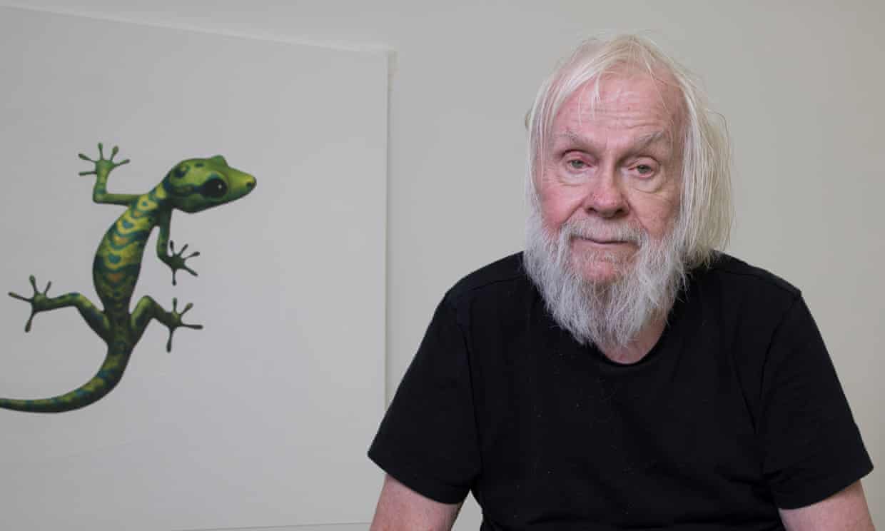
Mary Pratt is a master of colour and light. You get a sense of that just from this photo of her, and if you have ever seen her paintings, then you already know that. I have been studying her painting recently, and in search of more information of her, came across this great piece in Canadian Art. She passed away in 2018, but her art will live on long after this decade or even century has passed.

If you aren’t already a fan, I recommend knowing more about her and her work. That linked article is a good starting point.

The Art of Emily Bickell (and where you can get it)

One of my favorite artists is Emily Bickell, largely for her paintings of water, which I think are sublime. You can get affordable print versions of them here:  Traces Art Print by emilybickell | Society6.

Better still, you can get affordable original versions of them here: Art Interiors.

On Haring, Basquiat and the art that defined 80s New York


Some good links on the art of the 1980s, of which Basquiat and Haring played a big part, here and here.

Most of the time the links I post are mostly because I want other people to know about them. Links that talk about my youth are mainly for me. 🙂 But fans of either painter or art of that time should click through.

Painting above by Haring in tribute to Basquiat. May they both RIP.

The Most Influential Artists of 2019 according to Artsy

It seems every year the website Artsy puts together a list of artists who were recently influential. The lists are always interesting, mixing artists you likely heard of (e.g., Jeff Koons) and others you may hear more of.  It’s a great way to find out what artists are making a difference right now.

I had not heard of Mrinalini Mukherjee before. (Not that I even pretend to know everything about the current art world.) But I am glad to have discovered her for myself. Go here and learn more for yourself: The Most Influential Artists of 2019 – Artsy

(Image about is of Mukherjee and a featured work of hers.)

In praise of gray (the colour)

Gray is a beautiful colour, but it is hard to appreciate. If you feel that way, I recommend this piece, which is beautifully write about this beautiful colour: Ode to Gray

And then there are these quotes by Gerhard Richter about the colour gray.

I’d love to read more such pieces on colours that mean so much to artists. These two artists make me appreciate gray more than I ever did.

Tourism posters in the pandemic era


It’s not a fun time, and it’s not an era for travel, but if you want a souvenir of your non-travels from the pandemic, head on over to Colossal and check out:  Witty ‘Coronavirus Tourism’ Posters Advertise the Thrilling Adventures of Staying Home

Better still, if you like the one above, or any of the other ones, visit the artist’s commercial site and buy one!

Hey, what’s the point of (non) travel if you don’t get a souvenir or two.

It’s a good time to check out the Criterion Channel

If you are tired of other streaming services, or if you want to improve the films you are watching, now is a good time to check out the high quality films on  The Criterion Channel.

Right now they have a 14 day free trial. Now, if you are not a cinephile, the list of films they have could feel daunting. To make it simple, here is a list of 50 essential films you can watch there, with reasons why you want to see them.

If you aren’t sure, you can check out Criterion films streaming on Netflix, Apple TV and more. Consider giving them a try, though.

Mario Moore and his paintings of blue-collar workers who ‘really run things’…

…is a fantastic story you can read about here:  Princeton University portraits lacked diversity, so artist Mario Moore painted blue-collar workers who ‘really run things’ – The Washington Post.

His painting is fine, and the subject matter he has chosen especially so. Check out the story: it has many of his works on display too.

Three good pieces on Anselm Kiefer, in the Guardian

Anselm Kiefer had a big show in England this year, and that lead me down a rabbit hole reading pieces in the Guardian on him.  Never boring in his art work or his interviewers, anyone interested in knowing more about this great German artist can learn more here: