
Two good recent pieces on the great Dieter Rams, here:
Tag: design
The William hotel in NYC, or how to use bold colour in your home.
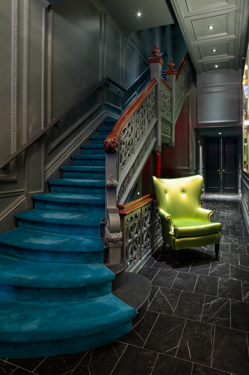
I have not stayed at the William, but I don’t need to in order to appreciate the beauty of the place (shown above). Regardless of your travel plans, if you have decorating plans, it’s a great place that illustrates how to effectively use bold colour in your home. For many, using bold colours can be both desirable and intimidating. Some concrete examples can help you achieve your bold colour dreams and overcome your bold colour fears.
For more, see this: A Bold, Colorful Hotel in the Heart of Manhattan – Design Milk
10 iconic Bauhaus furniture designs
![]()
For fans of Bauhaus, or those who want to become one, there’s this: 10 iconic Bauhaus furniture designs: chairs, tables, a lamp and a chess set.
It includes a number of pieces by Mies, including the Barcelona chair, shown above.
Taking a tiny home for a test drive

If you ever thought about living in a Tiny Home, here’s your chance to try them out before you buy one. Simply rent one of the ones listed here: Tiny House Rentals for Your Next Getaway (Apartment Therapy). There is a range of places and styles and prices for them.
I have thought of living in one myself, but wondered if I could manage. This could be one way to find out.
Photo courtesy HomeAway
Alternatives to Cloud White: two other Benjamin Moore white paints to consider
If you want an off white paint for your interiors, you can’t beat Cloud White from Benjamin Moore. However, if you do want to consider alternatives then these two articles agree that you want to look at either White Dove or Simply White, also by Benjamin Moore. These two pieces also go into detail as to when you want to use them (e.g. trim, kitchen cabinets). Before you start painting, check them out:
In praise of maximalism in decor

It’s rare to see a maximalist approach to decorating, but an exception is to be found here: House Tour: A Maximalist Apartment in Vicenza, Italy | Apartment Therapy.
If you are a fan of maximalism, like I tend to be, then this is exciting. If you are a minimalist, then this likely caused you some discomfort! 🙂 To each their own.
For those with the motto: More is More, click on the link for more ideas of how to fill up your space with beauty and the things you love. Minimalists will want to move on (unless they want to hate read it).
More on tiny homes

Two more tiny home stories. First up, Muji also has a tiny prefab home and you can see more pictures (like the one above) here: Muji Hut Launches With 3 New Tiny Prefab Homes Collection of 9 Photos by Aileen Kwun – Dwell.
Second, here is an odd but topical story for a tiny home heated by Bitcoin mining technology!
A tiny home that seems livable

Many tiny homes look nice to visit but the thought of living in something so small seems impossible. An exception to those homes are these MADi houses, featured here: MADi Flat Pack Tiny House – Fast Set Up Eco Friendly | Apartment Therapy.
They seem spacious, thanks to the A frame and all the windows. Better still, they seem very affordable. Tiny home fans (or skeptics), take note.
You can find more about them here.
Minimalist Cork Made Furniture by Daniel Michalik
Over at Fubiz they have some remarkable furniture made with cork, like this:

and this:

Not a relative, but a fine designer with a good last name 🙂 Check out this link for more: Minimalist Cork Made Furniture by Daniel Michalik – Fubiz Media
In an alternative universe this is the next hot smartphone

I am unexcited about the direction in Smartphone design. The key design idea that less is more in a phone is becoming Less is a Bore. Perhaps that’s why this design of a Blackberry got me thinking about it. While it still has a gorgeous screen, the phone itself is worthy of looking at and touching. It strikes the right balance. The phone as a design object is worthwhile.
It would have been good if Apple had struck out in a new design direction with the iPhone X. Instead they went with Less is More. Instead we have a phone with the Notch and a camera on the back that sticks out. It’s as if Apple would have preferred not to have these cameras and sensors, so rather than design the phone to incorporate them into the design, they stick out, figuratively and literally. In a few years from now when Apple has gone in a different direction, Apple fans will look back and exclaim how poor that aspect of the phone design is.
As for now, we live in an age where the screen dominates design, from TVs to smartphones. In the future that may change and the technology that we interact with will be contained in objects that have noteworthy design in them.
For more on this beautifully designed phone, see If BlackBerry Ditched the Keyboard | Yanko Design.
Quilting as a form of coding

First off, I think the quilts by Elizabeth Elliott are beautiful. Besides their beauty, I found it remarkable how she goes about making them. According to this piece, Quilts Made of Code by Elizabeth Elliott – Design Milk, the quilts are designed…
using a programming language called Processing. Through Processing, Elliott edits coding and generates random formations of geometric and traditional quilt block shapes. Afterward, she plays and edits the configuration until it becomes a quilt design she likes.
Here’s one more:
 .
.
Go see the Design Milk article to see more and get more information.
The digital beauty of Laura C Hewitt’s ceramics
I love the ceramics of Hewitt, especially for the way she works in digits as part of the overall work. Such as this piece

and this:

Now here’s what’s great. First, you can see more of her work here, at Colossal:
Kernel Panic: New Binary Ceramics Punctuated with Typewriter Keys by Laura C. Hewitt
Second, you can buy her work here, at her Etsy store!
It’s rare I can share work that is not only beautiful but that you can acquire. Glad I can do that here.
A peek inside the sublime new NYC residence designed by the great Zaha Hadid

Fortunate souls walking along New York’s High Line can catch a glimpse of the magnificent building pictured above. Now, thanks to Design Milk, you can get to see what it looks like inside by going here: 520 West 28th Condominium Residence by Zaha Hadid – Design Milk.
Not surprisingly, it is as gorgeous on the inside as it is on the outside. I would love to live there. Take a peek inside and you’ll see why.
What do you get when you mix architects and cats?

Some pretty wild cat homes, as you can see here: Inspired Outdoor Cat Shelters by Architects for Animals – Design Milk.
It’s worth checking out the article: some of the things architects build for their cats is really incredible. (Also there is a good chance the cat will just ignore it and go and squeeze into a nearby box).
A Portable, Flexible and Affordable Cardboard Standing Desk that is perfect for Road Warriors

This: A Portable, Flexible and Affordable Cardboard Standing Desk over at the site Design Milk, is a great design of a desk that not only is capable of transforming from a typical to a standing desk, but is also capable of being packed up and easily transported to different locations. For standing desk fans that travel to different work locations, it might be just the thing you need.
It’s strong too. Check out the link above and see what this piece of furniture can do. Impressive.
Glitches as a design pattern for fabric

The good folks at Glitchaus have taken an oddity of the digital world – glitches – and used it as the basis of their designs of scarves and wraps. If you are in need of either, or you’d just like to see some innovative fashion, it’s worth visiting their site.
A very cool Ikea Billy Bookshelves Hack
Over at themakerista.com is a very cool hack of 3 Billy bookcases that result in something with a built in look. Here’s the work in progress: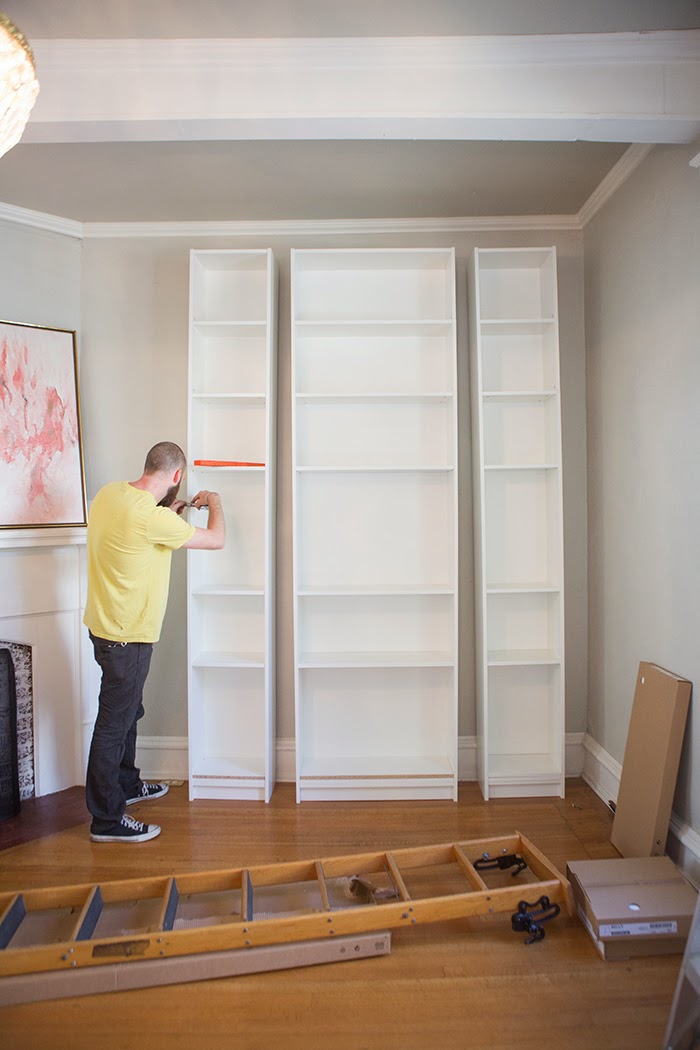
And here’s the final product:

You may not try something as challenging, but if you are interested in spiffing up your tired old bookcases, check this out this: The Makerista: Laura’s Living Room: Ikea Billy Bookshelves Hack
MyDomaine will make you appreciate IKEA in a new way
The folks at MyDomaine.com have a number of great articles of how to use IKEA furniture in a chic way. Here are four of them:
- 16 Astoundingly Chic IKEA Hacks | MyDomaine
- The 9 Best IKEA Designs of All Time | MyDomaine
- 8 Times IKEA Rugs Looked Anything But Budget | MyDomaine
- 10 Designers Share Their Favorite IKEA Pieces | MyDomaine
Well worth a look if you are on a budget and need to furnish your place. For example, I really like how they used IKEA bookcases to make this:

Why do Apple’s Macbook chargers cost so much?

Simple: they are a complex piece of technology. The photo above shows a Macbook charger from Apple on the left: the charger on the right is from another company. You can clearly see that the one from Apple has a lot more technology packed in there. And for good reasons. To understand what those reasons are, see this piece: Macbook charger teardown: The surprising complexity inside Apple’s power adapter. It was surprisingly interesting, from an engineering and design perspective.
Thanks to Tom Plaskon for sharing this on Twitter!
The history of a great collaboration: Philippe Starck, Ian Schrager and the rise of the NYC designer hotel

It seems commonplace now, but the idea of hotels having the same cachet as a nightclub seem to me to come about in the 1980s with the rise of Ian Schrager as a hotelier. While he collaborated with others, the partnership he formed with Philippe Starck resulted in some really fantastic hotels, as can be seen in this post: The 21st Century Interior – Case studies – Philippe Starck/Ian Schrager: Designer Hotels – Blog – APID.

Nowadays many of these hotels have changed, but in the latter part of the 20th century they were opening with all the excitement of a new nightclub, which in some ways they resembled. I remember hanging out in the lobby of The Royalton as it was just getting ready to open, talking to the staff in their Hugo Boss suits, marvelling over the designs of Starck, thinking of how the blue carpet made one feel as glamorous as anyone in the city. Later on I stayed at the Paramount and Morgan’s, each visit made Manhattan that much better.
Recently the hotels have been changing as they have been upgraded. Only The Hudson seems to have retained that earlier quality, it seems. Soon even that will transform into whatever brings in the guests. I haven’t been to The Hudson yet: I must get their before it is too late.
I am not sure if there is a history of great hotels, but if there ever is, I expect some of these places will find their place in it. Meanwhile, read the post on these hotels, and check out The Hudson in NYC while you can.
(Top photo of the Royalton, bedroom photo from the Paramount. Both linked to from the post, which has more great photos.)
Pebble and their smart watches are not going away yet
 After the Apple Watch came out, I wondered how this would affect Pebble, the company. Turns out, instead of folding, they have plans to evolve and grow. For evidence of this, check out their latest watch (in the photo, as well as here: Pebble Smartwatch | Smartwatch for iPhone & Android). They seem to be aiming to finding a market for those wanting some of the features of the Apple Watch without all the functionality (or cost).
With the watch above, you can see them adopting higher end materials and also getting thinner (and round). It is more expensive than the original Pebble, but likely better quality. And still much cheaper than Apple Watch.
I have a Pebble and I really like it. It does what I want, which is send me notifications without having to get out my phone, which is great in meetings, at events, or driving (carefully). And you can even easily write code for it. Finally, it is a great watch that needs to be rarely charged.
Needless to say, the Apple Watch is a great product. Depending on your needs, it could be a better choice than the Pebble. But the Pebble is a good product too, and I think there is a place in the market for a range of watch makers. Get one that suits your needs. With the Pebble, now you have more choice.
Some beautiful and inspiring examples of floor tiling to inspire (or fright you :))

This post, 12 Creative Ways To Use Floor Tile from Design Milk, has some beautiful and imaginative uses of floor tiles. The one above is one of my favorite, but all of them are great.
Something beautiful: an Infinite Bridge in Denmark
 This is a really beautiful bridge. It is relaxing to look at…it’s likely more so to walk upon.
For more images of it, see Infinite Bridge in Denmark – Fubiz Media
It’s Monday. You are stuck on conference calls. Here’s some Paris hotels to fantasize about
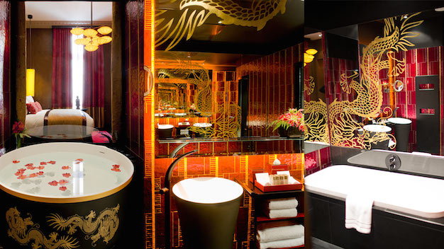
For people who love Paris and fine hotels, NOW Toronto Magazine offers up 5 Paris hotels for design junkies you want to see. Perfect if you are needing a break from work, real or imaginary. After you read the article and gaze over the photos, your next tab on your browser may be linking to google.com/hotels or google.com/flights. Bon voyage!
ICYMI: What is code, by Paul Ford
Happy Monday! Are you affected by code at work? Of course you are! Do you code at work yourself? Very likely, even if it is to use formulae in a spreadsheet program like Excel (which, years ago, would have required been considered coding). However code affects you, I highly recommend you read this:
Code. It’s a very rich piece on code (i.e. software) and what it means to you (and everyone else).
Among other things, it is brilliantly designed. Lots of hard work went into this piece. If you can’t get started yet this week at work, read this as a research project.
Do you like Apple product design? Then you should know about Dieter Rams

And if you don’t know about Rams, a good place to start is here: Dieter Rams | The Book of Life. One nice thing about this piece is that you can see many things he designed (including the radio in the photo above, next to the iPod).
On the unnecessary preciousness of architecture
Up against that, TD Centre still retains the purity of a temple. And you don’t put billboards on a temple, unless you want to anger the gods.
It’s worth reading that article to get a viewpoint of someone who thinks of architecture as something pure and museum-like.
To me, the owners of the TD buildings are doing reasonable things with a building that functions as a work environment. You can make the argument that the building should never vary from the original intent of the architect. You can also make a good if not better counter argument that the building should be able to adapt to changes over time, and that the building should allow for the people in it to make adaptions to suit them.
The author seems to be arguing that building should remain fixed and never change, never learn. If that seems like an odd idea — that building should learn — I recommend this book: How Buildings Learn, by Stewart Brand. You can get it here. Also, if you search for it on Google, you will see alot of material derived from it.
Amazing. Sculpture made from beauty supplies. Via collosal

Just from a technical point of view, these Incredible Peacocks Constructed from Beauty Supplies over at Colossal are amazing. However, they are not just technically amazing, but aesthetically quite striking, too.
Collosal has more photos showing this work. Well worth seeing.
Need a weekend project to do around your home? Here’s 10

From Remodelista, here are their Our Top 10 Weekend Projects. Something there for all sorts of skills, from klutz to adept.
If you like those, check out the rest of their DIY projects.
Travel posters! To Mars! From SpaceX, of course.
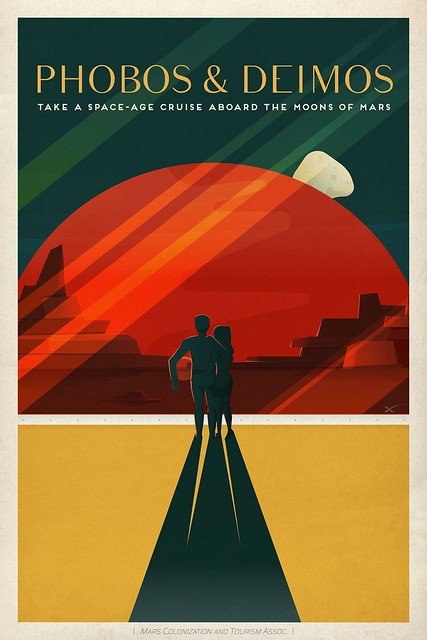
It’s great that SpaceX has put travel posters to Mars among their other photos on flickr (SpaceX Photos | Flickr). Of the three I saw, the one above was the one I liked the best. Head over to Flickr and check out the others.
It’s fun now, but perhaps such advertisements will be less fantastical before the 22nd century.
Would you like to design your own modern chair?
With Diatom » SketchChair software, you can.
These chairs aren’t for everyone….

…but as far as cool ideas go, I think this is one of them.
” The Apple Watch Is Going To Flop” articles are here, and …

…and I recommend you bookmark one or two to go back and read towards the end of the year to see how poorly they did and why they were wrong. This one, for example, You Guys Realize The Apple Watch Is Going To Flop, Right? | Co.Design | business + design, touches on a lot of things that are likely to be problematic about the new Apple Watch. Yet, the author makes the same two mistakes authors have been making about Apple since Steve Jobs returned: 1) looks at the failures of the competition and 2) looks at the limitations of the current technology. These are mistakes, because 1) Apple has a base of purchasers that has not let the company down in some time and that the competition will never have and 2) Apple has a way of having people focus on the potential, not the limitations.
The Apple Watch will be a success. I have no doubt. Wait and see.
(P.S. image sourced via a link to the article).
The elegance of (some) IKEA furniture
Domaine makes the case on this page and here on this one .
Can you spot the IKEA in this photo?

How about in this one?

Of course, it’s the composition and layout of all the furnishings in the room (and the room itself) that makes the spaces look great. However, you can also see the IKEA pieces, as the centerpieces, more than hold their own.
Would you live in an 8 square meter apartment that you had to walk up 7 floors to get to?
The answer seems obvious: no, right? Well, what if it were this apartment in a beautiful building in Paris?

You can see a sleeping area, a bathroom and a window. But there’s alot more hidden under the bed and the countertops .It’s really a gem of an apartment, and ingeniously designed.
For more on this place, including a video, go to this link.
An alternative for people looking into standing desks….
Might be this: a two legged chair

My own feeling is that the simplest and best solution may be just alternating between sitting and standing when at all possible. However, if you think that the two legged chair is the thing for you, head over to Design Milk for more on this.
For people with big todo lists and/or like to draw on walls
I give you this:

I really like this idea, but then I am an IT architect and we like to stand up and draw on walls (ok, whiteboards). A whiteboard would also work, but if you have kids, there may be times when you want to save anything they did. Or never mind kids: maybe your own doodle was keep sake worthy.
By the way, you can get such paper dispensers at IKEA. Most people mount them on a table, but clearly the wall is an option too.
One of the best style guides for men can be found ….

Here: Garb, from Uncrate.
This pix is just a sample; you can see lots more here: Garb: First Class | Uncrate. Lots of great looks and ideas. For men who are stylistically challenged, I recommend you go here and steal all the ideas you can.
Are you planning to move to a small space? You need this list
Over at A CUP OF JO is “15 Genius Tips for Living in Small Spaces” that really are worth a read if you live in or plan to move to a small apartment or condo or dorm. It’s advice taken from a couple that live in a 250 square foot place, and they practice what they advise. 250 square feet is very small, as you can see:

And yet it looks like a beautiful space. Take a look.
A wonderful minimalist desk for our wired times

This desk is beautiful and wonderfully minimalist. But what good is minimalism if you have a mess of cords behind all that simplicity? This desk takes care of that too.
For more photos and thoughts on the design, see A Minimalist Desk that Hides All Your Cords over at Design Milk.
In praise of small spaces, well designed (with an amazing bed)
I am a big fan of small spaces, well designed, and the one featured here certainly is a great example of that. What I found especially smart is the bed: instead of folding into the wall, it rises into the ceiling. Very smart, and very beautiful. Well worth a look.
